40 Data Analytics Datasets and Project Ideas (2026)


Introduction
Data analytics project ideas are everywhere, but most projects still read like coursework because they stop at charts instead of decisions. What hiring teams actually want to see is end-to-end analyst thinking: a well-framed question, defensible metric definitions, careful data cleaning and validation, and a clear recommendation that reflects real tradeoffs. The strongest portfolio projects look like something you would ship at work, such as a KPI dashboard, a concise analysis memo, or a reproducible notebook with assumptions and limitations spelled out.
This guide walks you through that full workflow, then gives you a curated set of dataset categories you can use to build interview-ready projects across common domains. You will find beginner-friendly datasets, Python-based automation and text projects, business and product analytics datasets, finance and economics data, sports and entertainment datasets, visualization-first dashboard datasets, and advanced options for forecasting and causal-style analysis. Each dataset section includes concrete, scoped project prompts so you can practice the same way you would for an analytics take-home or case interview, and then package the result into a portfolio artifact that recruiters can evaluate quickly.
How to Choose a Strong Data Analytics Project Topic
Choosing the right topic is the difference between a project that looks like homework and one that looks like real analyst work. Strong data analysis topics for projects are anchored in a clear business question, supported by feasible data, and packaged into a deliverable a stakeholder would actually use. This framework helps you quickly filter ideas for data analysis projects so you spend time building, not second-guessing.
What Makes a Project Topic Strong
Hiring managers review projects the same way they review real analytics work. This table shows the core criteria they consistently reward and what they look for in practice.
| Evaluation area | What reviewers look for | Common mistakes |
|---|---|---|
| Business question | A clear problem tied to a decision or outcome | Vague “explore the data” framing |
| Metrics | Defined KPIs with a reason for choosing them | Reporting every metric available |
| Data quality | Evidence of cleaning and validation | Ignoring missing or inconsistent data |
| Analysis depth | Comparisons, segments, or trends over time | One-off charts with no follow-up |
| Communication | Clear summary and recommendation | Raw outputs with no narrative |
Tip: Write your project title as a question a manager would ask, not as a dataset name. If it does not sound like a decision, refine it. Also, explicitly state what your analysis cannot answer and why. Experienced reviewers view this as analytical maturity, not weakness.
The 3-Lens Filter for Selecting Project Topics
Most weak projects fail because they only satisfy one dimension, usually data availability. Use this filter to quickly validate whether a topic is worth your time.
| Lens | Key question to ask | Pass criteria |
|---|---|---|
| Business value | Who would care about this result? | Clear stakeholder or use case |
| Feasible data | Can the data actually answer the question? | Required fields exist and are usable |
| Portfolio deliverable | Can this be shown clearly in one artifact? | Dashboard, memo, or notebook is obvious |
Tip: If you cannot describe the decision owner and review cadence (weekly, monthly, ad hoc), the topic is not anchored in real analytics usage.
Matching Project Difficulty to Skills Demonstrated
Your project topic should align with the level of role you are targeting. This table helps you choose topics that surface the right signals without overreaching.
| Project level | Core skills demonstrated | Example outcomes |
|---|---|---|
| Beginner | Data cleaning, descriptive statistics, basic visualization | Clean dataset and summary dashboard |
| Intermediate | Cohort analysis, segmentation, experimentation logic | KPI dashboard with written insights |
| Advanced | Forecasting, causal reasoning, anomaly detection | Analytical memo with recommendations |
Tip: It is better to execute a simpler project exceptionally well than to include advanced techniques you cannot clearly explain. Use advanced techniques only when they materially change the recommendation. If the conclusion is the same without them, leave them out.
Turning Vague Ideas into Strong Project Topics
Many data analytics project ideas start too abstract. The goal is to convert them into specific, testable questions.
| Vague idea | Refined project topic | Clear outcome |
|---|---|---|
| Customer churn | Which behaviors predict churn in the first 30 days? | Retention-focused dashboard |
| Pricing trends | How do price changes affect weekly demand? | Pricing sensitivity analysis |
| User funnels | Where do users drop off and why? | Funnel drop-off diagnosis |
Tip: Force yourself to define a time window, segment, or comparison group. Constraints improve clarity and credibility.
By applying this framework before you start building, you ensure your project topic highlights the exact skills interviewers want to see. For a deeper walkthrough on scoping analytics projects and preparing for take-home interviews, explore Interview Query’s guides on company-based interview preparation.
Where to Find Data Analytics Datasets
The quality of a data analytics project is tightly coupled to the quality and realism of the dataset behind it. Interviewers expect candidates to know where credible data comes from and to choose sources intentionally based on the problem being solved. The table below consolidates the most reliable, openly accessible dataset repositories used by analysts, with direct links so you can immediately explore and download data for your projects.
| Dataset source | Best suited for | Typical use cases |
|---|---|---|
| Kaggle Datasets | General analytics projects, practice, competitions | Exploratory analysis, cleaning, modeling, dashboards |
| Data.gov (US Government) | Large-scale, real-world public data | Policy analysis, economics, transportation, health |
| Google Dataset Search | Discovering datasets across domains | Dataset discovery and validation |
| World Bank Open Data | Global and economic analysis | Development indicators, country comparisons |
| FiveThirtyEight | Journalism-style, opinionated datasets | Sports analytics, polling analysis, storytelling |
| UCI Machine Learning Repository | Structured, well-documented datasets | Benchmark analysis, feature exploration |
| Tableau Public Datasets | Visualization-focused projects | Dashboards, storytelling, executive summaries |
| Dataquest Free Datasets | Beginner to intermediate analytics projects | End-to-end portfolio projects |
| Stony Brook University Dataset List | Academic and applied analytics | Research-style analysis, capstone projects |
| Open APIs (various providers) | Dynamic and near real-time analysis | Time series monitoring, automation |
Tip: Choose a dataset where you must justify data trust, scope, or exclusions in writing. Explaining why you accepted or rejected parts of the data signals analytical judgment and data governance awareness, both of which strongly differentiate senior candidates.
Quick Index: Data Analytics Datasets by Domain and Project Type
Use this index to quickly jump to the dataset category that best matches the type of data analytics project you want to build. Each category maps directly to the dataset groupings and project themes used later in this guide, and reflects how interviewers typically evaluate domain knowledge, analytical framing, and business relevance.
- Beginner-Friendly Data Analytics Datasets
- Python-Based Data Analysis and Automation Project Datasets
- Business and Product Analytics Datasets
- Finance and Economics Project Datasets
- Sports and Entertainment Analytics Datasets
- Visualization-First and Dashboard Project Datasets
- Advanced Analytics Project Data
Tip: Structuring projects by domain signals that you understand how analytics work differs across business contexts. Interviewers interpret this as domain fluency and an ability to adapt analytical thinking to real organizational problems, not just reuse the same techniques everywhere.
Beginner-Friendly Data Analytics Datasets
Beginner-friendly data analytics datasets are structured, well-documented, and large enough to support meaningful analysis without introducing excessive ambiguity. These datasets are commonly used in coursework, tutorials, and early-career portfolios because they allow candidates to demonstrate core analytics skills such as data cleaning, metric definition, segmentation, trend analysis, and insight communication. Interviewers use projects built on these datasets to assess whether a candidate can reason clearly with data before tackling production-scale complexity.
1. Mall Customers Dataset
Hosted on Kaggle
This dataset contains customer-level demographic and spending information collected from a retail mall. It is intentionally small and clean, making it suitable for learning customer segmentation and exploratory analysis without heavy preprocessing overhead.
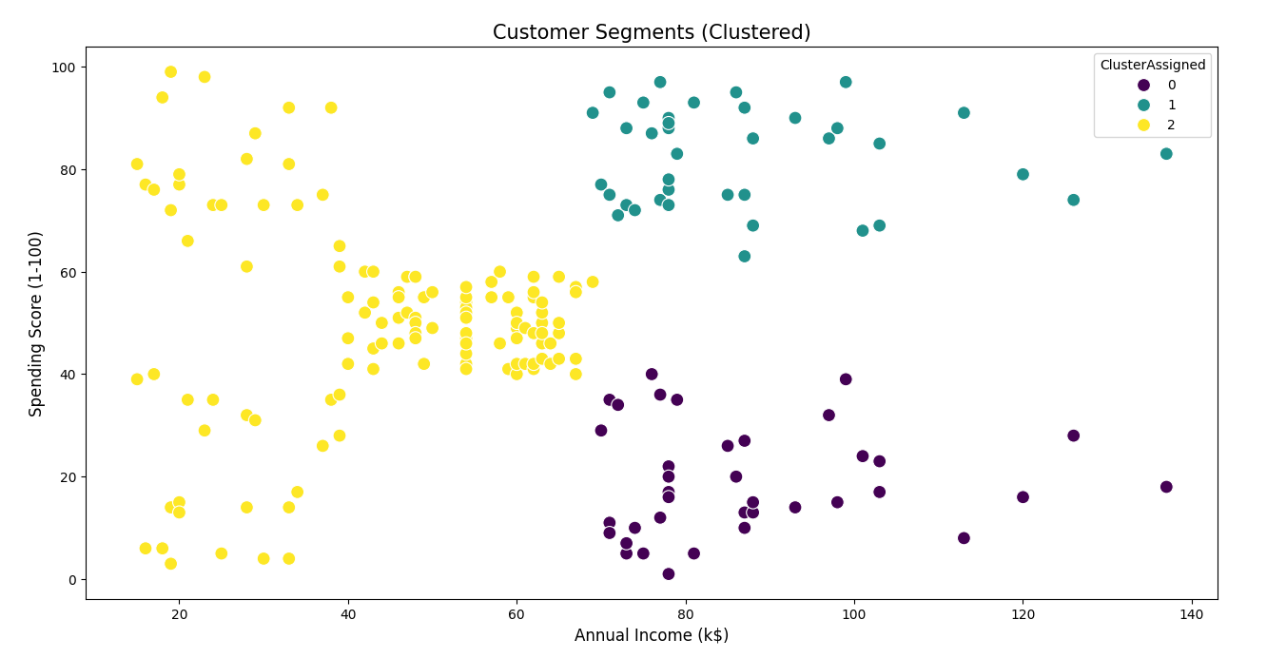
Key features
- 200 customer records with one row per individual
- Demographic variables including age and gender
- Annual income measured in thousands of dollars
- A normalized spending score ranging from 1 to 100
- No outcome variable, designed explicitly for clustering and exploratory work
Project ideas
- Perform customer segmentation using K-means or hierarchical clustering, then profile each segment by income and age distribution
- Compare clustering results before and after feature scaling to show sensitivity to preprocessing choices
- Translate segments into hypothetical business personas and propose targeted marketing strategies for each
Expert tip
Explain why the number of clusters you choose would be practical for a real marketing team to act on. This demonstrates decision framing and shows interviewers you think beyond algorithm outputs.
2. Supermarket Sales Dataset
Hosted on Kaggle
This dataset represents transactional sales data from a supermarket chain, covering multiple branches and product lines over a three-month period.
Key features
- 1,000+ transaction records
- Three store branches across different cities
- Product categories such as food, beverages, and electronics
- Transaction-level metrics including unit price, quantity, tax, total sales, and gross margin
- Date and time fields enabling hourly, daily, and monthly trend analysis
Project ideas
- Analyze revenue contribution by product line and branch, then identify which categories drive profit versus volume
- Study time-of-day and day-of-week purchasing patterns to infer staffing or inventory implications
- Compare customer ratings against basket size or spend to explore satisfaction drivers
Expert tip
Explicitly separate revenue metrics from profitability metrics in your analysis. This signals financial literacy and shows you understand how businesses evaluate performance.
3. Telco Customer Churn Dataset
Hosted on Kaggle
This dataset was released by IBM to simulate a real-world telecommunications churn problem. Each record represents a single customer and whether they churned during the observation period.
Key features
- 7,043 customer records
- 21 features covering demographics, contract terms, billing method, and service usage
- Binary churn label with roughly 26 percent churn rate
- Combination of categorical variables such as contract type and numerical variables such as monthly charges
Project ideas
- Calculate churn rates by contract type and tenure bucket to identify early churn risk windows
- Build a baseline churn model and evaluate recall versus precision tradeoffs under different retention cost assumptions
- Analyze which service add-ons are associated with lower churn after controlling for tenure
Expert tip
Tie churn findings to a retention budget constraint. This demonstrates business judgment and shows you understand how analytics informs tradeoffs, not just predictions.
4. Stack Overflow Annual Developer Survey
Provided by Stack Overflow
The Stack Overflow Developer Survey is a large, global survey conducted annually to understand developer demographics, compensation, tooling, and preferences.
Key features
- 49,000+ responses in the 2025 survey edition
- Respondents from over 170 countries
- Hundreds of survey variables including salary, experience, programming languages, databases, and AI tool usage
- Multi-select questions requiring careful handling during analysis
Project ideas
- Analyze compensation distributions by role, region, and years of experience, including percentile-based comparisons
- Segment respondents into developer personas based on tool stacks and work context
- Conduct a year-over-year trend analysis for emerging technologies while addressing survey question changes
Expert tip
Call out where survey data cannot support causal conclusions. This signals statistical maturity and builds trust with interviewers.
5. NYC Bike-Share Usage Dataset
Hosted on Kaggle
This dataset contains public bike-share trip data from New York City, commonly associated with Citi Bike usage. One commonly used open version includes approximately 735,000 trips recorded between 2015 and 2017, making it suitable for time-series and geospatial analysis.
Key features
- Hundreds of thousands of trip records
- Trip duration and precise start and end timestamps for each ride
- Start and end station identifiers with latitude and longitude
- Rider type information distinguishing subscribers from casual users
- Strong daily, weekly, and seasonal usage patterns
Project ideas
- Analyze peak usage hours and seasonal trends to identify commuting versus recreational usage patterns
- Perform station-level analysis to identify the most frequently used start and end points, then map top routes
- Compare subscriber and casual rider behavior in terms of trip duration, time of day, and station usage
Expert tip
Use time-based train and test splits when modeling trends. This demonstrates awareness of temporal leakage and real-world validation practices.
6. Cookie Cats Mobile Game A/B Test Dataset
Hosted on Kaggle
This dataset captures the results of an A/B test run by a mobile game to evaluate how moving a gameplay gate affected user retention.
Key features
- Over 90,000 player records
- Control and treatment groups defined by gate placement
- Retention indicators at day 1 and day 7
- Player engagement metrics such as game rounds played
Project ideas
- Compute retention differences between test and control groups with confidence intervals
- Analyze heterogeneous treatment effects by player activity level
- Present a rollout recommendation based on statistical and practical significance
Expert tip
Frame your conclusions in terms of rollout risk and opportunity cost. This shows you can connect experimental results to product decisions.
Once you’ve chosen a dataset, practice the types of problems hiring managers actually test. Explore Interview Query’s data analytics questions to sharpen your metric design, case reasoning, and decision-focused communication.
Python-Based Data Analysis and Automation Project Datasets
Python-based data analysis projects evaluate your ability to work with data that is larger, messier, or more operational than beginner datasets. These projects typically involve programmatic data ingestion, text processing, time-based aggregation, or automation. Interviewers use them to assess whether you can structure analysis pipelines, handle scale and complexity, and make defensible analytical choices using Python libraries such as pandas, NumPy, scikit-learn, and statsmodels.
7. E-Commerce Price Tracker Dataset
Hosted on Kaggle
This dataset contains historical price data scraped from major e-commerce retailers. A commonly referenced subset tracks power drill prices across Amazon, Home Depot, Lowe’s, and Walmart over a fixed observation period, enabling longitudinal price comparison.
Key features
- Thousands of price observations collected via web scraping
- Product identifiers and product names for individual SKUs
- Retailer source field indicating the website where the price was captured
- Price values paired with scrape dates, enabling time-series analysis
- Data collected at irregular intervals, reflecting real scraping constraints
Project ideas
- Build a Python workflow that aggregates daily prices per product and retailer, then computes price volatility and average price gaps
- Identify short-lived price drops using rolling windows and z-score thresholds to flag potential promotions
- Compare pricing consistency across retailers by measuring how often each retailer is the lowest-priced option over time
Expert tip
Explain how irregular scrape timing affects trend interpretation. This demonstrates data realism awareness and guards against overconfident conclusions.
8. Job Postings and Skills Trends Dataset
Hosted on Kaggle
This dataset contains more than 124,000 job postings scraped from LinkedIn during 2023–2024, making it suitable for large-scale text analysis and labor market trend studies.
Key features
- Job title, company name, and full job description text
- Posting date, job location, and industry or category fields
- Semi-structured natural language descriptions suitable for keyword extraction
- Incomplete salary and seniority information, reflecting real-world job postings
Project ideas
- Extract skill keywords from descriptions and compute their frequency trends over time
- Compare demand for specific skills across cities or regions using normalized posting counts
- Analyze how required skills differ between junior and senior job titles based on text patterns
Expert tip
Describe how you handled synonymy and keyword ambiguity in text extraction. This signals methodological care in natural language processing.
9. Social Media Sentiment and Engagement Dataset
Hosted on Kaggle
This dataset contains 1.6 million tweets labeled for sentiment polarity, commonly used as a benchmark for sentiment analysis.
Key features
- Binary sentiment labels (positive or negative)
- Raw tweet text with hashtags, mentions, and URLs
- Timestamp and user metadata fields
- Data collected over a defined historical period, not in real time
Project ideas
- Compare average engagement metrics across sentiment classes using summary statistics
- Group tweets by hashtag or keyword and analyze sentiment balance within topics
- Measure how sentiment distributions vary by time of day or posting period
Expert tip
Clearly separate sentiment classification performance from engagement analysis. This shows you understand where labels end and inference begins.
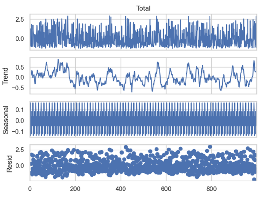
10. Airline Passengers Time Series Dataset
Hosted on Kaggle
This dataset records monthly airline passenger counts from January 1949 to December 1960, totaling 144 observations.
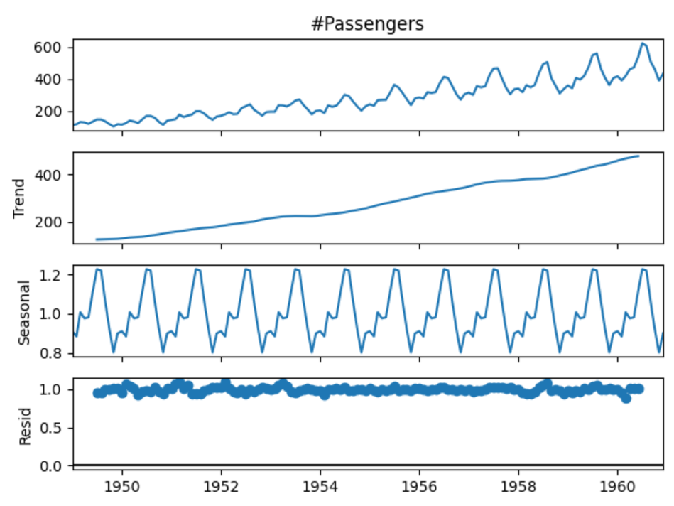
Key features
- Monthly time series with one observation per month
- Passenger counts measured in thousands
- Clear upward trend over time
- Strong annual seasonality with repeating peaks and troughs
Project ideas
- Decompose the series into trend, seasonal, and residual components
- Train a forecasting model using a rolling-origin evaluation strategy
- Compare forecast accuracy between seasonal and non-seasonal models
Expert tip
Explain why your evaluation window matches how forecasts would be used operationally. This shows applied time-series reasoning.
11. MovieLens 1M Movie Ratings Dataset
Provided by GroupLens Research
This dataset supports recommendation system analysis and collaborative filtering.
Key features
- 1,000,209 ratings
- Approximately 6,040 users and 3,900 movies
- Ratings on a discrete 1–5 scale
- Movie metadata including genres and release year
- Each user has rated at least 20 movies
Project ideas
- Build a user-based or item-based collaborative filtering model
- Analyze rating distributions across genres and release periods
- Identify movies with high variance in ratings and discuss interpretive implications
Expert tip
Discuss cold-start limitations explicitly. This signals system-level thinking beyond algorithm output.
12. Uber Pickups Geospatial Dataset (NYC 2014)
Hosted on Kaggle
This dataset contains Uber pickup records in New York City during April–September 2014, totaling over 4.5 million trips.
Key features
- Timestamped pickup events at high temporal resolution
- Latitude and longitude coordinates for each pickup
- Coverage across all NYC boroughs
- Base or dispatching company identifiers
Project ideas
- Cluster pickup locations to identify high-demand zones
- Analyze hourly pickup volume patterns by borough
- Compare weekday versus weekend demand dynamics
Expert tip
Validate spatial clusters against known city landmarks or transit hubs. This shows grounding analysis in real-world context.
13. Daily Minimum Temperatures in Melbourne Dataset
Hosted on Kaggle
This dataset contains daily minimum temperatures recorded in Melbourne from 1981 to 1990, totaling approximately 3,650 observations.
Key features
- Daily date field spanning ten years
- Minimum temperature measured in degrees Celsius
- Clear seasonal cycles tied to Southern Hemisphere climate
- Year-to-year variability suitable for forecasting evaluation
Project ideas
- Fit a seasonal forecasting model and evaluate one-year-ahead predictions
- Engineer calendar-based features such as day-of-year and season indicators
- Compare regression-based and time-series-based forecasting approaches
Expert tip
Justify why your chosen forecasting horizon matches realistic planning needs. This signals applied modeling judgment.
Business and Product Analytics Datasets
Business and product analytics datasets reflect how organizations use data to understand user behavior, evaluate performance, and guide decisions around growth, pricing, retention, and operations. These datasets typically mirror internal company tables such as users, transactions, events, and support logs. They are especially valuable for portfolio projects because success is measured by decision quality and business impact, not just model accuracy.
14. Online Retail Transactions (Online Retail II)
Hosted by UCI Machine Learning Repository
This dataset contains transactional data from a UK-based online retailer between 2009 and 2011. Each row represents an individual product-level transaction, including purchases and cancellations, making it suitable for revenue analysis, customer behavior modeling, and cohort studies.
Key features
- Over 1 million transaction records across two years
- Invoice-level and product-level granularity
- Fields include invoice number, product description, quantity, unit price, customer ID, and transaction timestamp
- Includes negative quantities and cancellations, reflecting real-world data quality issues
Project ideas
- Build a revenue and customer activity dashboard showing daily, weekly, and monthly sales trends, with explicit handling of cancellations and returns.
- Perform cohort analysis based on first purchase month to measure retention, repeat purchase behavior, and long-term revenue contribution.
- Identify high-value customers using recency, frequency, and monetary value, then analyze product categories driving lifetime value.
Expert tip
Explicitly document how you handle returns and negative quantities before analysis. Interviewers look for this to assess data-cleaning judgment and whether your metrics reflect actual business revenue.
15. E-Commerce Discount and Sales Performance Dataset
Hosted on Kaggle
This dataset contains historical sales data for an e-commerce business, including pricing, discount levels, quantities sold, and order dates. It is well suited for analyzing promotional effectiveness and revenue drivers.
Key features
- Thousands of order-level records spanning multiple years
- Fields include order date, product category, quantity ordered, unit price, sales value, and discount indicators
- Time-based structure allows trend and seasonality analysis
- Product-level granularity supports category and pricing comparisons
Project ideas
- Analyze the relationship between discount levels and total revenue, separating volume effects from margin impact.
- Compare performance across product categories to identify which products are most sensitive to promotions.
- Build a time-series analysis of sales performance before, during, and after discount periods to evaluate promotional lift.
Expert tip
Avoid claiming discounts “cause” higher sales unless you control for seasonality and product mix. This shows statistical discipline and signals that you understand the limits of observational data.
16. Customer Support Tickets Dataset
Hosted on Kaggle
This dataset simulates customer support interactions, capturing ticket metadata such as issue type, priority, timestamps, and resolution status. It mirrors operational analytics commonly done by support and product teams.
Key features
- Thousands of support ticket records
- Ticket attributes including issue category, priority, status, creation time, and resolution time
- Text-based issue descriptions suitable for basic NLP
- Time-based fields enabling SLA and workload analysis
Project ideas
- Analyze resolution time by issue category and priority to identify bottlenecks and SLA risks.
- Build a priority classification model to flag tickets likely to require escalation.
- Create an operational dashboard showing ticket volume trends, backlog size, and average resolution time over time.
Expert tip
Use time-based train test splits and discuss how misclassifying high-priority tickets affects operations. This demonstrates production awareness and cost-sensitive evaluation skills.
17. SaaS Subscription and Churn Analytics Dataset
Hosted on Kaggle (IBM sample dataset)
This dataset contains customer-level subscription data from a telecommunications company, released by IBM as a realistic churn modeling example. It closely resembles SaaS subscription tables used by growth and retention teams.
Key features
- 7,043 customer records with one row per customer
- 20+ features including contract type, tenure, monthly charges, payment method, and service usage
- Binary churn label with moderate class imbalance
- Mix of categorical and numerical variables requiring encoding and feature engineering
Project ideas
- Build a churn prediction model and compare recall-focused versus cost-weighted evaluation strategies.
- Analyze feature importance to identify contract and pricing drivers of churn risk.
- Simulate a retention policy by targeting high-risk customers and estimating potential revenue saved.
Expert tip
Translate churn scores into an explicit business action such as who gets contacted and at what cost. Interviewers want to see decision framing, not just model performance.
18. Product Usage Funnel Dataset
Hosted on Kaggle (RetailRocket)
This dataset tracks user interactions such as product views, add-to-cart events, and purchases. It is designed for funnel analysis and behavioral product analytics.
Key features
- Over 2.7 million event records
- Event-level data with user ID, item ID, event type, and timestamp
- Supports session-based and funnel analysis
- Sparse purchase events relative to views, reflecting real product usage patterns
Project ideas
- Define and analyze a conversion funnel from view to purchase, measuring drop-off at each stage.
- Segment users by behavior patterns such as browsers versus buyers and compare conversion rates.
- Analyze time-to-purchase distributions to identify friction in the customer journey.
Expert tip
Write down the funnel definition and metric logic before querying the data. This demonstrates product sense and avoids silent metric inconsistencies that interviewers often test for.
19. Airbnb Listings by City
Provided by Inside Airbnb
This dataset contains detailed listings, calendar availability, and review data for Airbnb properties across major cities worldwide. It is widely used for marketplace and supply-demand analysis.
Key features
- City-level datasets ranging from tens of thousands to over 100,000 listings
- Listing attributes including price, availability, room type, location, and host information
- Review counts and timestamps that can be used as a demand proxy
- Geographic coordinates enabling spatial analysis and mapping
Project ideas
- Build a pricing and supply dashboard for a chosen city, including price distributions, availability rates, and neighborhood heatmaps.
- Create a host concentration analysis by estimating the share of listings controlled by multi-listing hosts across neighborhoods.
- Combine listing and review data to construct a demand proxy and analyze how demand relates to pricing and availability.
Expert tip
Clearly label reviews as a proxy for demand and test robustness across neighborhoods. This signals analytical integrity and responsible use of imperfect signals.
Want a structured roadmap instead of random practice? Follow the Data Analytics 50 Learning Path to systematically build the SQL, metrics, and case skills top companies expect.
Finance and Economics Project Datasets
Finance and economics datasets are used to analyze markets, measure risk, evaluate financial performance, and understand macroeconomic trends. These datasets typically involve time series, panel data, or highly imbalanced outcomes, and they reward careful metric design, validation discipline, and clear assumptions. In interviews, finance-focused projects are often evaluated on how well you reason about uncertainty, risk, and tradeoffs rather than just predictive accuracy.
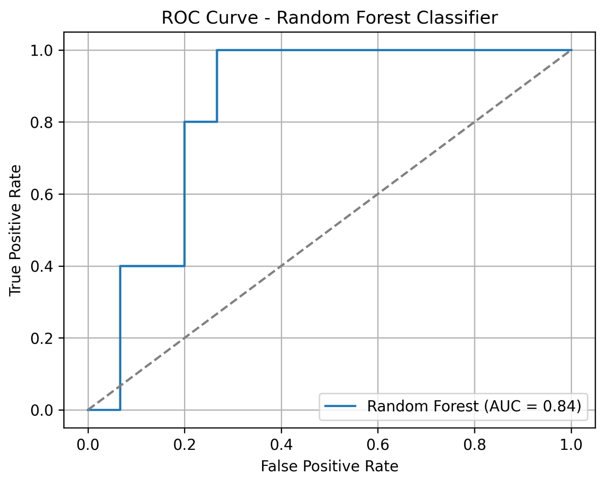
20. Credit Card Transactions Fraud Detection
Hosted on Kaggle (ULB Machine Learning Group)
This is a classic real-world fraud detection dataset containing anonymized credit card transactions made by European cardholders. It is widely used to demonstrate anomaly detection and imbalanced classification techniques.
Key features
- 284,807 total transactions recorded over two days
- 492 fraudulent transactions, representing roughly 0.17 percent of all observations
- 30 numerical features, where 28 are PCA-transformed for confidentiality
- Includes transaction time (seconds since first transaction) and transaction amount
Project ideas
- Train and evaluate fraud detection models using precision-recall curves and cost-sensitive metrics rather than accuracy.
- Compare supervised and unsupervised approaches such as logistic regression versus isolation forests for identifying anomalous transactions.
- Simulate an operational thresholding strategy and estimate false positive volume at different recall targets.
Expert tip
Explicitly justify your evaluation metric and decision threshold in business terms. This demonstrates risk awareness and an understanding of how model outputs translate into operational cost.
21. Stock Market Historical Price Data (Stooq)
Provided by Stooq
Stooq provides free, downloadable historical price data for global equities, indices, exchange-traded funds, futures, and currencies. The data is offered as clean CSV files with no authentication required, making it a reliable source for reproducible financial time-series analysis.
Key features
- Daily historical price data for thousands of assets across U.S. and international markets
- Fields include open, high, low, close, and trading volume
- Coverage spans multiple decades for major stocks and indices
- Data is organized by asset class with bulk and per-symbol CSV downloads
- Consistent formatting suitable for automated ingestion and backtesting
Project ideas
- Analyze historical returns and volatility for a selected stock or index, then compare it against a market benchmark using rolling windows.
- Measure drawdowns and recovery periods to evaluate downside risk and capital preservation characteristics.
- Build and backtest simple rule-based strategies such as moving average crossovers, explicitly separating in-sample exploration from out-of-sample evaluation.
Expert tip
Clearly distinguish exploratory signal discovery from backtesting and report results using out-of-sample performance. Interviewers look for evidence that you understand overfitting risk and proper validation in financial modeling.
22. Lending Club Loan Data
Hosted on Kaggle
This dataset contains peer-to-peer loan data from Lending Club, including borrower information, loan terms, and repayment outcomes. It is commonly used for credit risk modeling.
Key features
- Millions of loan records spanning multiple years
- Borrower attributes such as income, employment length, credit history, and loan purpose
- Loan performance outcomes including fully paid, charged off, or default
- Mix of numerical and categorical variables with missing data
Project ideas
- Build a default risk model and compare performance across different loan grades.
- Analyze how interest rates and borrower characteristics relate to default probability.
- Segment borrowers into risk tiers and simulate portfolio-level loss scenarios.
Expert tip
Discuss how your model would be validated over time, not just randomly split. This signals an understanding of credit risk stability and model governance.
23. World Bank World Development Indicators
Provided by The World Bank
This dataset aggregates hundreds of economic indicators across countries and years, covering growth, education, health, trade, and demographics. It is a standard source for macroeconomic analysis.
Key features
- Thousands of indicators across 200+ countries
- Annual time series data spanning multiple decades
- Includes GDP, inflation, unemployment, trade balances, and population metrics
- Structured panel data with missingness across countries and years
Project ideas
- Analyze long-term GDP growth trends across regions and income groups.
- Study the relationship between education indicators and economic growth using panel data techniques.
- Build comparative country dashboards highlighting macroeconomic differences over time.
Expert tip
Clearly state how you handle missing values and cross-country comparability. This demonstrates economic reasoning and data integrity awareness.
24. Federal Reserve Economic Data (FRED)
Provided by Federal Reserve Bank of St. Louis
FRED provides a large collection of U.S. and international economic time series, commonly used by economists, analysts, and policy researchers.
Key features
- Over 800,000 economic time series
- Indicators include interest rates, inflation, employment, housing, and monetary aggregates
- High-frequency data such as daily, weekly, monthly, and quarterly series
- Programmatic access via API for reproducible analysis
Project ideas
- Analyze the relationship between interest rates, inflation, and unemployment over time.
- Perform recession analysis using leading and lagging indicators.
- Build a macroeconomic monitoring dashboard that updates automatically via API.
Expert tip
Explain why specific indicators are chosen and how timing differences affect interpretation. Interviewers view this as evidence of macroeconomic literacy.
25. IMF World Economic Outlook Database
Provided by International Monetary Fund
This dataset includes historical data and forecasts for key macroeconomic indicators across IMF member countries, often used for global economic analysis.
Key features
- Country-level macroeconomic data and projections
- Indicators such as GDP growth, inflation, government debt, and fiscal balance
- Annual frequency with historical and forecast values
- Consistent methodology across countries
Project ideas
- Compare IMF forecasts against realized outcomes to evaluate forecast accuracy.
- Analyze debt-to-GDP trends across advanced and emerging economies.
- Build scenario analyses using alternative growth assumptions.
Expert tip
Clearly distinguish observed data from forecasts in your analysis. This shows rigor and prevents misleading conclusions, a trait interviewers strongly value.
Sports and Entertainment Analytics Datasets
Sports and entertainment datasets are well suited for analytics projects because they combine intuitive outcomes with rich historical depth. These datasets often involve sequential decision-making, performance trends over long horizons, optimization under constraints, and cultural consumption patterns. Interviewers value projects in this category because they test your ability to work with time-dependent data, define meaningful metrics, and tell a coherent story that connects data to real-world decisions.
26. NFL Play-by-Play Data (Win Probability Modeling)
Hosted on Github, also available on Kaggle
This dataset contains detailed play-by-play records for National Football League games across multiple seasons. Each row represents a single play, capturing game context, play outcome, and score state. It is widely used by analysts and researchers to build expected points and win probability models.
Key features
- Game-level and play-level identifiers, including game ID and play sequence
- Game context variables such as quarter, time remaining, down, yards to go, and field position
- Score context for both teams before and after each play
- Play descriptors including play type (run or pass) and yards gained
- In some versions, pre-computed expected points or win probability estimates for the offense
Project ideas
- Build a win probability timeline for a selected game and highlight plays that caused the largest shifts in win probability, focusing on late-game or high-leverage moments.
- Analyze fourth-down decision-making near midfield by comparing outcomes when teams go for it versus punt, using changes in expected points or win probability to quantify risk and reward.
- Compute player-level performance metrics in high-leverage situations, such as quarterback efficiency when win probability is very low or very high.
Expert tip
Focus your analysis on leverage, not averages. Demonstrating that you can identify and model decision-critical moments shows strong judgment and an understanding of how analytics informs coaching strategy.
27. NBA Player Performance Trends
Hosted on Kaggle
This dataset contains season-level statistics for National Basketball Association players across decades, enabling analysis of both individual careers and league-wide trends. Each record typically represents a player’s performance in a given season.
Key features
- Player, season, and team identifiers
- Games played and minutes per game
- Per-game statistics such as points, rebounds, assists, steals, and blocks
- Shooting efficiency metrics such as field goal percentage and three-point percentage
- In some versions, advanced metrics like player efficiency rating or win shares
Project ideas
- Analyze league-wide trends by plotting average points per game or pace across seasons to illustrate how the style of play has evolved over time.
- Visualize a single player’s career trajectory by charting key statistics across seasons and annotating major events such as peak years or injury periods.
- Perform clustering on player stat lines for a given season to identify player archetypes, such as primary scorers, defensive specialists, or all-around contributors.
Expert tip
Normalize statistics by era or pace when comparing players across time. Interviewers look for this adjustment to assess whether you understand context-driven bias in historical comparisons.
28. Fantasy Sports Optimization (Fantasy Premier League)
Hosted on Github, also available on Kaggle
Fantasy Premier League datasets combine real-world soccer performance with a game layer that includes player prices, points, and roster constraints. This makes them ideal for optimization and decision analysis projects.
Key features
- Player information including name, team, and position
- Fantasy price for each player, which can change over the season
- Fantasy points accumulated from goals, assists, clean sheets, and other actions
- Supporting statistics such as minutes played, goals, and assists
- Implicit constraints defined by game rules, such as total budget and roster composition limits
Project ideas
- Formulate an optimization problem to select a fantasy squad that maximizes total points under budget and positional constraints, and compare it against a baseline team.
- Conduct a value analysis by computing points per unit of cost and identifying players who consistently outperform their price.
- Simulate a simple transfer strategy based on early-season performance and evaluate how it would perform relative to an average or static team.
Expert tip
Clearly state the objective function and constraints before solving the optimization. This signals structured problem formulation, a key skill for analytics roles involving tradeoffs.
29. Music Chart Trends (Billboard Hot 100)
Hosted on Kaggle
This dataset tracks the weekly ranking of the top 100 songs in the United States over several decades. Each entry represents a song’s position on the chart for a given week, enabling long-term trend and popularity analysis.
Key features
- Weekly chart entries with date, song title, artist, and rank
- Rank values from 1 to 100 for each week
- Derived metrics such as weeks on chart and peak position
- Long historical coverage supporting cross-era comparisons
Project ideas
- Analyze song longevity by identifying tracks with the longest chart runs or longest time at number one and comparing patterns across decades.
- Build an artist-level timeline showing when songs entered the chart and how high they peaked, highlighting periods of dominance or decline.
- Examine changes in chart composition over time, such as shifts in artist turnover or concentration at the top ranks.
Expert tip
Use derived metrics like weeks-on-chart rather than single-week rank. This demonstrates an ability to engineer features that better capture sustained popularity.
30. Streaming Service Viewership Data (Netflix Top 10)
Hosted by Netflix Tudum, also available on Kaggle
Netflix publishes weekly Top 10 lists showing the most-watched movies and television shows, often including total hours viewed. These datasets are well suited for analyzing modern content consumption patterns.
Key features
- Weekly reporting periods for Top 10 rankings
- Titles ranked from 1 to 10 within categories such as movies and television series
- Global viewership metrics, often measured in hours watched
- Time series structure enabling analysis of rise-and-fall patterns
Project ideas
- Track the weekly trajectory of a popular title to visualize how viewership spikes after release and decays over time.
- Analyze seasonality in overall Top 10 viewership by aggregating hours watched across weeks and identifying recurring peaks.
- Compare movies and television series by measuring how long each typically remains in the Top 10, highlighting differences in consumption dynamics.
Expert tip
Frame insights around content lifecycle rather than popularity alone. Interviewers value candidates who can translate viewership curves into implications for content strategy and release planning.
Strong projects matter, but interviews test how you reason about them. Use Interview Query’s data science question bank to practice translating real datasets into clear, defensible answers under interview conditions.
Visualization-First and Dashboard Project Datasets
Visualization-focused projects emphasize clarity, storytelling, and decision support rather than algorithmic complexity. These datasets are well suited for dashboards, maps, timelines, and comparative charts that help stakeholders quickly understand patterns, trends, and tradeoffs. Interviewers use projects in this category to evaluate whether you can choose the right chart for the question, design visuals that scale, and guide interpretation without overwhelming the audience.
31. Sample Superstore Dataset (Sales Dashboard) [Download Data]
Sample Superstore is a widely used demonstration dataset for business intelligence tools such as Tableau and Power BI. It represents sales orders for an office supplies retailer across products, customers, and regions, making it ideal for executive-level dashboards.
Key features
- Approximately 9,994 sales order records
- Order-level details including order ID, order date, and ship date
- Product attributes such as category, sub-category, and product name
- Sales metrics including sales amount, quantity, profit, and profit margin
- Customer and geographic fields such as customer ID, city, state, and region
Project ideas
- Build an executive sales and profit dashboard featuring key metrics such as total sales, total profit, and profit margin, supported by category-level and region-level breakdowns.
- Create a geographic visualization showing sales and profit by state to highlight top-performing and underperforming regions.
- Identify loss-driving sub-categories and use visuals to contrast high-revenue versus high-margin product groups, framing recommendations for improvement.
Expert tip
Design the dashboard around decisions, not charts. Interviewers look for whether each visual answers a specific business question rather than simply displaying available fields.
32. Global Earthquakes Dataset (Story Map)
Hosted on Kaggle, given by USGS
This dataset contains records of significant earthquakes worldwide over multiple decades, including location and magnitude. It is well suited for geographic and time-based visual storytelling.
Key features
- Hundreds of significant earthquake events over a multi-decade period
- Date and time of each earthquake
- Latitude and longitude for precise mapping
- Magnitude and depth measurements
- Descriptive fields such as event title or region
Project ideas
- Build an interactive world map plotting earthquakes with marker size or color scaled by magnitude, paired with a time slider to animate events over years.
- Create a time-series chart showing the annual count of high-magnitude earthquakes and discuss whether apparent trends reflect real change or natural variability.
- Use spatial clustering or density maps to visualize seismic hot spots and relate them to known tectonic plate boundaries.
Expert tip
Be explicit about what the visualization does and does not imply. This demonstrates analytical responsibility and avoids misleading viewers with spurious trends.
33. Contagious Disease Incidence Dataset (Public Health Visualization)
Given by Tycho Project
Historical contagious disease datasets, such as U.S. measles incidence by state and year, are commonly used to visualize the impact of public health interventions like vaccination programs.
Key features
- Location identifiers such as state or national aggregates
- Yearly or weekly time granularity
- Disease identifiers enabling filtering to a single disease
- Case counts, often paired with population data for incidence rates
Project ideas
- Create a before-and-after time-series visualization of measles incidence per 100,000 people, clearly annotating the introduction of the measles vaccine as a structural break.
- Build a heatmap with states on one axis and years on the other, color-coded by case counts or incidence rates to show geographic spread and decline over time.
- Compare regional trends to identify states or regions with slower declines and discuss potential contributing factors.
Expert tip
Annotate policy or intervention milestones directly on the chart. Interviewers value candidates who connect data patterns to real-world events clearly and responsibly.
34. CO₂ Emissions by Country Dataset
Hosted by Kaggle
This dataset tracks annual carbon dioxide emissions by country over long time horizons, making it ideal for comparative and longitudinal visualizations.
Key features
- Country-level identifiers
- Annual time series data spanning decades or centuries
- Total CO₂ emissions measured in metric tons
- In some versions, derived metrics such as per-capita emissions
Project ideas
- Create small multiple line charts for major emitting countries to compare emission trajectories over time on a consistent scale.
- Build a paired visualization comparing cumulative emissions since a historical baseline with current annual emissions to contrast historical responsibility versus present impact.
- Design an interactive map with a year slider to show how global emissions intensity shifts geographically over time.
Expert tip
Maintain consistent axes across small multiples. This signals strong visualization judgment and prevents viewers from misinterpreting relative growth or scale.
35. User Retention Cohort Dataset (E-commerce Events History)
Hosted on Kaggle
This dataset contains detailed user-level event logs from an online cosmetics store, capturing browsing, cart, and purchase behavior over time. It is well suited for cohort-based retention analysis and visualization, closely mirroring event-tracking data used by product and growth teams.
Key features
- Over 2.7 million user interaction events
- Event-level records including product views, add-to-cart actions, and purchases
- User and item identifiers enabling longitudinal behavior tracking
- Timestamped events that support sessionization and cohort definition
- Naturally sparse conversion events relative to views, reflecting real e-commerce funnels
Project ideas
- Build a cohort retention heatmap with cohorts defined by first activity month and retention measured by repeat engagement or purchases in subsequent months.
- Create line-based cohort retention curves to compare behavior across acquisition periods, highlighting whether newer cohorts retain better or worse over time.
- Compare retention before and after a hypothetical product change by splitting cohorts around a defined event date and visualizing differences in engagement decay.
Expert tip
Write out your cohort and retention definitions before building the visualization. Interviewers pay close attention to this step because small logic changes can materially alter retention conclusions.
Advanced Analytics Project Data
Advanced data analytics projects go beyond descriptive analysis and basic modeling. They test whether you can reason about uncertainty, incorporate external factors, design counterfactuals, and interpret results responsibly. Interviewers evaluate these projects less on technical novelty and more on whether assumptions are clear, validation is sound, and conclusions are framed as decision support rather than absolute truth.
36. Demand Forecasting With Exogenous Factors (Rossmann Store Sales)
Hosted on Kaggle
The Rossmann Store Sales dataset contains daily sales data for a large German drugstore chain, along with promotional, holiday, and competitive information. It is a canonical dataset for multivariate demand forecasting with external drivers.
Key features
- Daily sales records for 1,115 stores spanning more than two years
- Target variable representing daily revenue per store
- Open or closed indicator, with closed days showing zero sales
- Promotion flag indicating whether a store ran a promotion on a given day
- State holiday and school holiday indicators affecting customer traffic
- Store metadata such as store type, competition distance, and competitor opening date
Project ideas
- Build a time series forecasting model that incorporates promotions and holiday indicators as exogenous variables and compare performance against a seasonal naive baseline.
- Run what-if simulations by toggling promotion flags to estimate incremental sales during promotional periods.
- Evaluate forecast accuracy using metrics such as mean absolute percentage error and root mean squared error, and analyze where external factors add the most value.
Expert tip
Explain why each external variable belongs in the model and what behavior it represents. Interviewers look for causal intuition behind features, not just accuracy gains.
37. Causal Impact of a Policy or Intervention
Dataset sources (direct dataset access):
This project focuses on estimating causal impact when no randomized experiment exists. The goal is to construct a credible counterfactual using historical data and a control series. The Google Analytics sample data is commonly used because it has a realistic web analytics schema and long-enough history to support pre/post designs in time series.
Key features
- Time series of a primary metric such as daily sessions, transactions, revenue, or conversion proxy metrics
- Clearly defined intervention date (for example, site redesign or pricing change)
- One or more control series not affected by the intervention (or a synthetic control built from correlated series)
- Sufficient pre-intervention history to establish baseline trends and seasonality
Project ideas
- Estimate the impact of a website redesign by modeling expected traffic without the redesign using a control series, then report lift with uncertainty intervals and sensitivity checks.
- Build a synthetic control from multiple correlated time series (channels, geographies, or device types) and show diagnostics for pre-period fit quality.
- Stress-test conclusions by moving the intervention date, running placebo tests, and reporting how results change under alternative control definitions.
Expert tip
Treat “control quality” as the main product deliverable. Showing pre-period fit diagnostics and placebo tests demonstrates causal discipline and signals senior-level judgment.
38. Uplift Modeling and Incremental Impact Framing (Bank Marketing Dataset)
Hosted on UCI Machine Learning Repository
This dataset captures direct marketing campaigns conducted by a Portuguese bank, including customer attributes, campaign details, and whether the client subscribed to a term deposit.
Key features
- Client demographics such as age, job, and marital status
- Campaign attributes including number of contacts and contact timing
- Binary outcome indicating whether the client subscribed
- Treatment-like indicator representing campaign exposure (and practical constraints around non-random assignment)
Project ideas
- Build separate outcome models for treated and untreated customers and compute uplift as the difference in predicted probabilities.
- Compare targeting strategies from a standard response model versus an uplift-based approach and show how selected customers differ.
- Visualize uplift distributions to illustrate how marketing resources would be allocated more efficiently.
Expert tip
Emphasize that uplift modeling optimizes incremental impact, not raw conversion. Interviewers view this framing as a sign of advanced marketing analytics thinking.
39. Anomaly Detection at Scale (Numenta Anomaly Benchmark)
Hosted on Github
The Numenta Anomaly Benchmark (NAB) provides labeled time series datasets designed for evaluating anomaly detection algorithms under realistic conditions.
Key features
- Time series metrics sampled at regular intervals
- Multiple datasets representing different real-world scenarios
- Seasonal patterns and non-stationary behavior
- Labeled anomaly windows for evaluation
Project ideas
- Apply univariate anomaly detection methods to identify deviations from expected seasonal patterns and visualize detected anomalies.
- Extend to multi-series scenarios by detecting entities that diverge significantly from group baselines.
- Evaluate detection performance using precision and recall and discuss tradeoffs between sensitivity and false alarms.
Expert tip
Optimize for “operator time,” not only F1 score. Reporting alert volume per day and time-to-detection shows you understand monitoring as an operational system.
40. Experimentation Guardrails and Multi-Metric Decision Frameworks
Hosted by UCI Machine Learning Repository
This dataset, commonly known as the Online Shoppers Purchasing Intention Dataset, contains session-level data from an e-commerce website, including behavioral metrics, conversion outcomes, and technical performance indicators. While not a pre-labeled A/B test, it is well suited for experiment simulation and guardrail analysis, which mirrors how experimentation frameworks are often taught and evaluated in interviews.
Key features
- 12,330 user sessions with one row per session
- Behavioral metrics such as page values, bounce rates, exit rates, and session duration
- Technical performance indicators including page load and session quality proxies
- Binary conversion outcome indicating whether a purchase occurred
- Mixed numerical and categorical features suitable for metric segmentation
Project ideas
- Simulate an A/B test by defining treatment and control groups based on a behavioral or site-change proxy, then evaluate conversion lift alongside guardrail metrics such as bounce rate or exit rate.
- Build an experiment results table that reports primary metrics (conversion rate) and guardrail metrics (engagement or performance proxies), then write a launch decision based on predefined thresholds.
- Analyze tradeoffs between conversion lift and user experience by identifying scenarios where higher conversion coincides with degraded guardrail metrics.
Expert tip
Define guardrail thresholds before analyzing results and treat them as hard constraints on launch decisions. Interviewers look for evidence that you can prevent shipping wins that harm long-term user experience.
After building your portfolio, test your thinking with Interview Query’s data analytics questions and practice framing metrics, tradeoffs, and decisions under interview pressure.
FAQs
What makes a data analytics project portfolio-worthy?
A portfolio-worthy data analytics project starts with a clear question and ends with a decision or insight that matters. Strong projects define metrics carefully, explain trade-offs, and show how results would be used by a stakeholder. Recruiters value projects that demonstrate judgment and communication just as much as technical execution. Even simple analyses stand out when the problem framing and takeaway are clear.
How many projects should a data analyst have?
Most entry-level and early-career data analysts should aim for three to five well-developed projects rather than many small ones. Each project should showcase a different skill, such as exploratory analysis, visualization, forecasting, or business decision-making. Quality matters more than quantity, especially if you can explain your thinking deeply. A smaller set of strong projects is easier to discuss in interviews.
Are Excel projects acceptable for data analytics roles?
Yes, Excel projects are absolutely acceptable, especially for business-focused or entry-level data analytics roles. Excel is widely used in industry for analysis, reporting, and decision support, and recruiters recognize that. What matters is whether your project demonstrates structured thinking, clear metrics, and actionable insights. Pairing Excel projects with one or two Python or SQL projects can strengthen your overall portfolio.
What are the best data analysis project ideas for students?
The best project ideas for students solve realistic problems using accessible data. Examples include sales performance analysis, customer retention cohorts, public health trends, or sports analytics. Projects that use open datasets and mirror real business questions tend to resonate more than abstract exercises. Focus on explaining your choices and results clearly rather than using advanced techniques prematurely.
What should I do if my dataset is messy or incomplete?
Messy or incomplete data is normal and can actually make your project stronger. Document how you handled missing values, outliers, or inconsistencies and explain the impact of those choices. Interviewers appreciate transparency and sound judgment more than perfect data. Treat data cleaning as part of the analysis, not a problem to hide.
How do I choose between Python, SQL, and Tableau for a project?
Choose the tool that best fits the question you are answering, not the one that feels most impressive. Python works well for complex analysis and modeling, SQL is ideal for querying and aggregating large datasets, and Tableau excels at interactive storytelling. Many strong projects use more than one tool. What matters is explaining why each tool was appropriate for that stage of the work.
How long should a data analytics project take to complete?
A strong project typically takes two to four weeks of part-time effort. This includes time for exploration, analysis, iteration, and writing a clear README. Rushing often leads to shallow insights, while over-polishing can delay progress unnecessarily. The goal is to produce a complete, explainable case study, not a perfect model.
What is a good structure for a data analytics case study?
A good case study follows a simple narrative: problem, data, approach, results, and decision. Start by explaining the question and context, then describe the data and methodology at a high level. Present results with visuals or metrics, and close with a business takeaway and limitations. This structure mirrors how analytics work is discussed in interviews.
Conclusion
Choosing the right data analysis projects and presenting them clearly is what turns practice into real interview leverage. By working with realistic datasets, framing strong business questions, and communicating decisions through structured case studies and visuals, you build skills that translate directly to analytics interviews. This guide gives you a practical foundation, but focused preparation makes the difference.
To go deeper, practice with Interview Query’s SQL and analytics question bank, explore company interview guides to align your projects with real hiring expectations, or get personalized feedback through Interview Query’s coaching program. Pick a dataset, apply the framework, and turn your analysis into insights that decision-makers can trust.