50+ Free Datasets for Data Science Projects in 2026


Introduction
Finding strong data science datasets is often more challenging than building the model itself. Useful data is scattered across research portals, government sites, and community repositories. Many datasets are locked behind paywalls, poorly documented, outdated, or cleaned to the point that they no longer reflect real-world behavior. Others look promising at first but fail under closer inspection due to unclear targets, hidden leakage, or structures that make proper evaluation impossible. This is why many projects stall early or fall apart in interviews.
This guide consolidates 50+ free datasets that are accessible, well-documented, and commonly used across industry and applied research. Each dataset was selected because it supports clear problem framing, realistic modeling constraints, and defensible evaluation across tasks such as classification, forecasting, natural language processing, computer vision, and recommendation systems. Together, these datasets enable end-to-end projects that reflect how data science is actually practiced and evaluated, making them well suited for both skill development and portfolio work.
How to Choose a Dataset for Data Science Projects
Choosing the right dataset is a decision-making step, not a formality. Strong data science datasets make it easier to define a clear problem, apply appropriate techniques, and defend modeling choices in interviews. The same criteria also determine whether a dataset is worth practicing on, whether you are building a first portfolio project or continuing to sharpen your skills as an experienced data scientist.
The steps below follow the same order used in real project scoping: confirm viability, identify hidden risks, validate quality quickly, then match complexity to your skill level.
1. Start by checking dataset fundamentals
Before thinking about models or algorithms, confirm that the dataset can support a meaningful and defensible problem. These fundamentals determine whether a project is viable at all. If any of these fail, no amount of modeling will rescue the project.
| Fundamentals to check | What to look for | Why it matters |
|---|---|---|
| Clear objective | A defined prediction target or analysis goal | Prevents vague projects with no measurable outcome |
| Stable definitions | Columns mean the same thing across rows and time | Avoids misleading patterns and broken features |
| Sufficient volume | Enough rows for train, validation, and test splits | Enables honest evaluation |
| Realistic complexity | Some noise or missing values | Reflects real-world data science work |
Tip: Before writing any code, write one sentence describing the problem and one metric you would use to evaluate success. If this is unclear, the dataset is not ready for a serious project.
2. Identify common structural issues early
Once the dataset looks viable, the next step is to check for hidden structural problems that invalidate results later. These issues often surface only after hours of work, so identifying them early saves time and prevents false confidence.
| Common issue | What it looks like | Impact on your project |
|---|---|---|
| Data leakage | Features include future or outcome-related information | Inflated metrics and failed interviews |
| Unclear grain | It is ambiguous what one row represents | Incorrect joins and double counting |
| Weak or missing labels | Target values are sparse or inconsistent | Unreliable training and evaluation |
| Duplicate entities | Same user, product, or event appears multiple times unintentionally | Biased models and distorted metrics |
| Time leakage | Random splits applied to time-based data | Unrealistic performance estimates |
Tip: Manually inspect five to ten random rows and trace how each feature would be generated in the real world. This step demonstrates strong data intuition and shows interviewers you understand how leakage actually occurs.
3. Run a quick dataset quality checklist
After confirming structure, use a short checklist to decide whether the dataset is worth committing to for a full project. This step forces clarity before deeper investment.
| Question | What a good answer looks like |
|---|---|
| What is the prediction target or analysis goal? | Clearly defined and measurable |
| What is the grain of the data? | One row equals one consistent entity or event |
| Are labels reliable and non-leaky? | Defined independently of future information |
| Is there enough data for validation splits? | Separate train, validation, and test sets |
| Are features available at prediction time? | No post-outcome information |
| Is documentation available? | Data dictionary or clear column descriptions |
| What is the license and privacy stance? | Explicit and safe for portfolio use |
| Can you define a baseline and metric? | Simple benchmark and evaluation plan |
Tip: If you cannot confidently answer at least six of these questions in under a minute, pause and reassess. This mirrors how experienced data scientists decide whether a dataset is worth further effort.
4. Match dataset complexity to your skill level
Only after the dataset passes quality checks should you evaluate whether it aligns with your current experience and target role. Strong projects favor clarity and correctness over unnecessary complexity.
| Skill level | Recommended dataset traits | Typical tasks | Example project output |
|---|---|---|---|
| Beginner | Clean tabular data, clear labels, low missingness | Classification, regression, simple dashboards | Model report with basic error analysis |
| Intermediate | Multiple tables, time component, moderate missingness | Forecasting, churn modeling, basic recommendation | End-to-end pipeline with validation |
| Advanced | Large-scale or unstructured data, noisy or weak labels | Natural language processing, computer vision, ranking | Robust evaluation and deployment-ready demo |
Tip: Choose the simplest dataset that still allows you to demonstrate strong evaluation discipline. Interviewers consistently reward correct framing, clean validation, and clear reasoning over technical complexity.
Quick Index of Data Science Datasets by Domain and Task
Use this index to quickly jump to the dataset category that best matches the type of data science project you want to build. Each category maps to common project themes and interview expectations.
- Business, Marketing, and Customer Analytics Datasets
- Retail, E-commerce, and Marketplace Datasets
- Finance, Economics, and Risk Datasets
- Healthcare and Public Health Datasets
- Climate, Environmental, and Energy Data
- Natural Language Processing and Text Datasets
- Computer Vision and Image Data
- Time Series and Forecasting Datasets
- Recommendation and Ranking Data
Business, Marketing, and Customer Analytics Datasets
Business and customer analytics datasets show how companies turn customer behavior into decisions that drive revenue and retention. In practice, teams use this data to predict churn, target campaigns, or estimate future spending based on demographics, usage, and transaction history. A common project starts with a retention problem, models churn risk, and then converts those scores into actions such as targeted offers, pricing changes, or onboarding improvements. These datasets matter because they closely mirror production workflows, with clear labels, mixed feature types, and success measured by business impact rather than model accuracy alone.
1. Telco Customer Churn (IBM)
Hosted on Kaggle
This dataset contains customer-level records from a telecommunications company, released by IBM as a realistic churn modeling example. Each row represents a single customer with service usage, contract details, billing information, and a binary churn label, making it a clean but realistic starting point for supervised learning.
Key features
- 7,043 customer records with one row per customer
- 20+ features covering demographics, services, and billing
- Binary churn label with moderate class imbalance
- Mix of categorical and numerical variables suitable for feature engineering
Project ideas
- Build a churn prediction model and compare recall-focused versus cost-sensitive evaluation
- Analyze feature importance to identify contract or service drivers of churn
- Simulate a retention strategy by targeting high-risk customer segments
2. Bank Marketing Dataset (Download Data)
Hosted by UCI Machine Learning Repository
This dataset captures the outcomes of direct marketing campaigns conducted by a Portuguese banking institution. Each row corresponds to a client contact, with attributes describing the client, the campaign context, and whether the client subscribed to a term deposit.
Key features
- Over 45,000 campaign contact records
- 16 input features plus a binary subscription outcome
- Strong class imbalance reflecting real marketing response rates
- Well-documented feature definitions
Project ideas
- Predict campaign success and evaluate precision versus recall tradeoffs
- Identify customer segments most responsive to outreach
- Compare interpretable models to more complex classifiers
3. Mall Customers Dataset
Hosted on Kaggle
This dataset contains basic demographic and spending information for customers of a retail mall. While smaller and cleaner than enterprise datasets, it is useful for learning segmentation and unsupervised learning techniques.
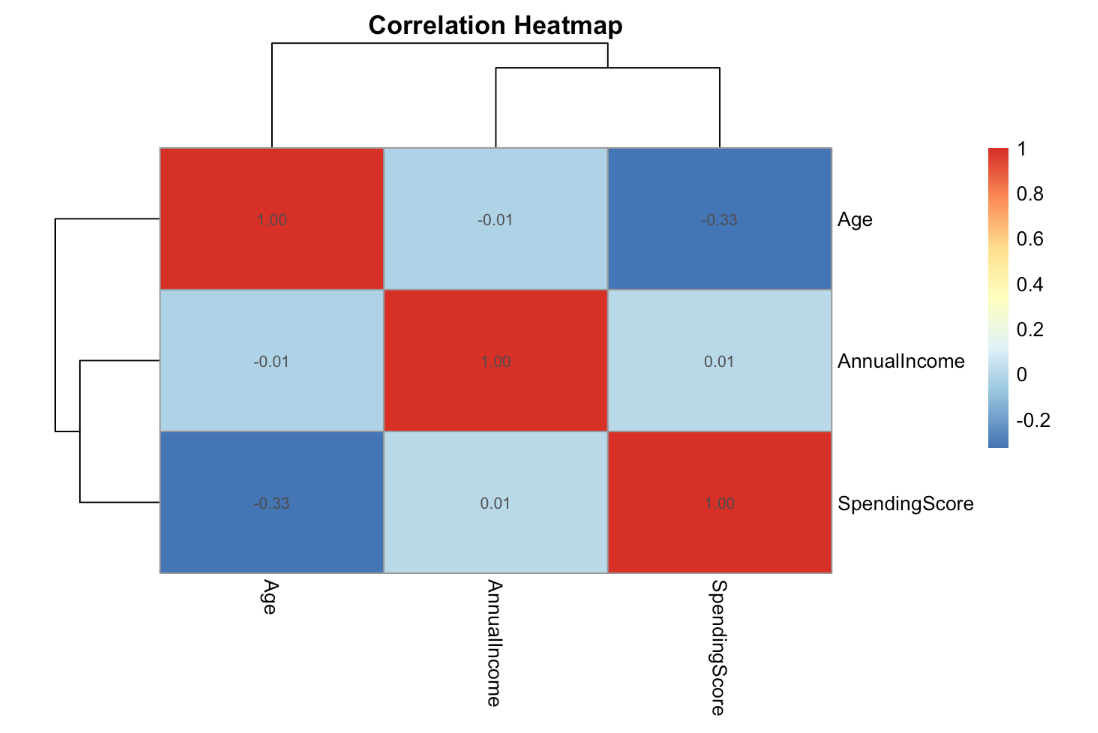
Key features
- 200 customer records
- Features include age, gender, annual income, and spending score
- No labeled outcome, designed for clustering tasks
- Simple schema ideal for exploratory analysis
Project ideas
- Perform customer segmentation using clustering algorithms
- Visualize clusters and interpret behavioral differences
- Compare clustering results under different scaling assumptions
4. Customer Personality Analysis
Hosted on Kaggle
This dataset provides a richer view of customer behavior, combining demographics, purchasing habits, campaign responses, and family structure. It is well suited for advanced segmentation and response modeling.
Key features
- Over 2,200 customer profiles
- 25+ features spanning purchases, campaigns, and household data
- Multiple marketing response indicators
- Structured data with realistic correlations
Project ideas
- Segment customers based on purchasing and campaign behavior
- Predict likelihood of response to future campaigns
- Analyze how household and income features influence spending
5. Black Friday Sales Dataset
Hosted on Kaggle
This dataset contains transactional data from Black Friday sales at a retail store, including customer demographics, product categories, and purchase amounts. It is commonly used for regression and demand analysis tasks.
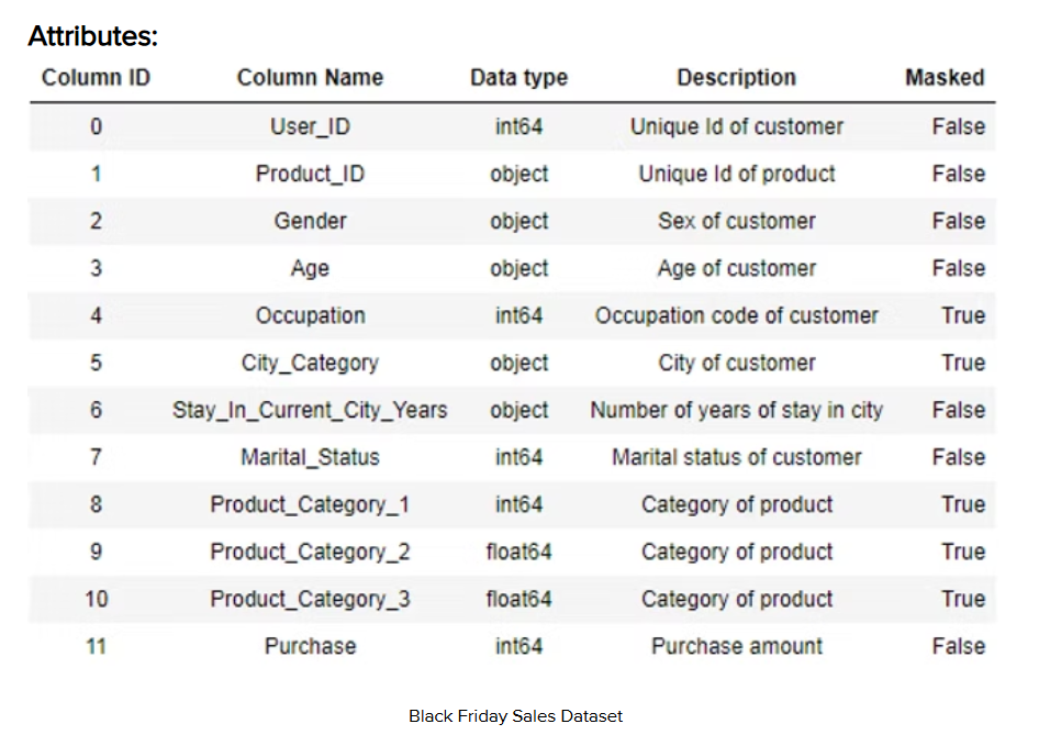
Key features
- Over 550,000 purchase records
- Customer-level demographics and product categories
- Continuous target variable representing purchase amount
- High-cardinality categorical features
Project ideas
- Predict purchase amount using demographic and product features
- Analyze spending patterns across age and gender groups
- Engineer category-level features to improve model performance
6. NYC 311 Service Requests (2020 to Present)
Hosted on NYC Open Data
NYC 311 requests are a real operational dataset that behaves like a production support queue: high volume, messy free text, shifting categories, and strong seasonal patterns. It is ideal for projects that look like “real work,” such as service level analysis, triage models, and workload forecasting.
Key features
- 42,019,727 rows (and growing), which supports big-data workflows and scalable feature engineering
- Service request lifecycle fields (created date, closed date), categories, location fields, and free-text descriptors suitable for structured and text features
- Strong time effects (hour-of-day, day-of-week, seasonal spikes) that naturally test leakage-safe splitting and drift awareness
- Realistic label ambiguity (complaint types and resolutions can shift over time), which is useful for demonstrating evaluation discipline
Project ideas
- Forecast ticket volume by complaint type and borough, then quantify staffing implications under different error costs
- Build a triage classifier that predicts high-priority cases, then validate performance by time-based backtesting
- Use natural language processing to cluster emerging issues and detect “new topic” spikes earlier than category counts
7. Stack Overflow Annual Developer Survey
Provided by Stack Overflow
The Stack Overflow Developer Survey is a large, well-documented survey dataset that is excellent for segmentation, trend analysis, and communicating insights to a non-technical audience. The 2025 survey reports 49,000+ responses across 177 countries, which gives enough scale to support stable subgroup analysis and clear storytelling.
Key features
- 49,000+ responses (2025) with broad geographic coverage and many multi-select variables
- Survey structure includes demographics, work context, tools, databases, languages, and AI usage patterns (excellent for segmentation)
- Clean “analysis-ready” format compared to most behavioral datasets, allowing you to focus on insight quality and statistical care
- Natural opportunities for weighting considerations, missingness handling, and multiple comparison caution in conclusions
Project ideas
- Build a segmentation analysis that identifies developer personas (tool stacks, experience, AI usage), then write a stakeholder-ready narrative
- Create a compensation or satisfaction model with careful validation and a clear discussion of causal limits
- Run a year-over-year trend study (for example, AI tool adoption) and show how you handle question changes and comparability issues
Expert tip
For business-focused datasets, explicitly translate model outputs into an operational decision such as who to target or how to allocate budget. This demonstrates business judgment and shows interviewers you can connect predictive models to real-world impact, not just metrics.
Once you’ve chosen the right dataset, practice the questions interviewers actually ask. Explore Interview Query’s data science questions to sharpen your modeling intuition, evaluation judgment, and problem-solving speed.
Retail, E-commerce, and Marketplace Datasets
Retail, e-commerce, and marketplace datasets reflect how online businesses track user activity and turn transactions into operational decisions. In practice, teams use this data to forecast demand, optimize pricing, recommend products, and manage inventory across time and locations. A typical project might start with raw order and event logs, engineer session- or customer-level features, and model outcomes such as purchase likelihood or delivery delays. The real value comes from using those predictions to improve conversion, reduce churn, or streamline fulfillment. These datasets are especially valuable because they mirror production systems, with high volume, strong time dependence, and decisions that directly affect customer experience.
8. Online Retail II Dataset (Download Data)
Direct access via UCI Machine Learning Repository
This dataset contains transactional data from a UK-based online retailer over multiple years. Each row represents a single product-level transaction, making it ideal for customer lifetime value analysis, cohort analysis, and basket-level modeling.
Key features
- Over 1 million transaction records
- Time range covering multiple full retail years
- Fields include invoice number, product ID, quantity, price, customer ID, and timestamp
- Negative quantities included to represent returns, reflecting real-world messiness
Project ideas
- Build customer lifetime value models using historical purchase behavior
- Perform cohort analysis to measure retention and repeat purchasing
- Identify frequently co-purchased items for bundle recommendations
9. Instacart Market Basket Analysis
Hosted on Kaggle
This dataset captures anonymized grocery shopping behavior from Instacart users. It is widely used to demonstrate recommendation systems, association rule mining, and sequence-based modeling.
Key features
- Over 3 million grocery orders
- More than 200,000 unique users
- Product, aisle, and department hierarchies
- Order-level sequencing information for repeat purchases
Project ideas
- Build a next-product recommendation model
- Analyze reorder behavior and customer loyalty patterns
- Perform market basket analysis using association rules
10. NYC TLC Trip Record Data
Provided by New York City Taxi and Limousine Commission
This dataset contains detailed trip-level data for yellow, green, and for-hire vehicles operating in New York City. It is one of the most commonly used large-scale public datasets for time series analysis and spatial modeling.
Key features
- Hundreds of millions of trip records across multiple years
- Trip-level timestamps, pickup and drop-off locations, fares, and tips
- Monthly parquet and CSV files suitable for big data tools
- Strong temporal and geographic structure
Project ideas
- Forecast taxi demand by location and time of day
- Analyze tipping behavior across neighborhoods and seasons
- Build surge or congestion prediction models
11. Brazilian E-commerce Public Dataset
Hosted on Kaggle
This dataset represents orders placed on a large Brazilian e-commerce platform and includes customer, seller, product, and logistics data. It is particularly valuable for end-to-end relational modeling projects.
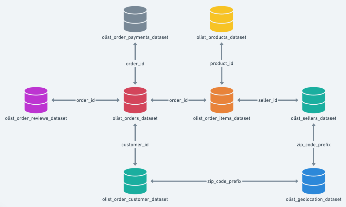
Key features
- Nearly 100,000 orders with multiple relational tables
- Separate datasets for customers, sellers, products, and payments
- Delivery timestamps enabling logistics and delay analysis
- Realistic join complexity across tables
Project ideas
- Predict late deliveries using order and seller features
- Analyze seller performance and customer satisfaction
- Build an end-to-end SQL plus modeling pipeline
12. Retailrocket Events Dataset
Hosted on Kaggle
This dataset captures real e-commerce browsing behavior at the event level, including product views, add-to-cart actions, and transactions. It is a strong choice for recommendation, sequence modeling, and purchase-intent prediction because it reflects how users move through a funnel from browsing to conversion.
Key features
- 2,756,101 total events across the dataset (Kaggle)
- 1,407,580 unique visitors (Kaggle)
- Event breakdown includes 2,664,312 views, 69,332 add-to-carts, and 22,457 transactions (Kaggle)
- Includes item properties and a category tree to support content-based and hybrid recommenders (Kaggle)
Project ideas
- Build a purchase-intent model that predicts transaction likelihood from recent event sequences
- Create a session-based recommender using view and add-to-cart sequences
- Analyze funnel drop-off patterns and quantify which behaviors precede conversion
Expert tip
When working with transactional retail data, explicitly define the unit of prediction such as customer, order, or time window before modeling. Being clear about data grain shows interviewers that you can prevent leakage and design models that align with how decisions are actually made in production systems.
Finance, Economics, and Risk Datasets
Finance, economics, and risk datasets reflect how organizations make decisions under uncertainty when outcomes have real financial or regulatory consequences. In practice, teams use this data to detect fraud, assess credit risk, forecast markets, or evaluate economic trends while accounting for time delays and imperfect information. A strong project might frame default or fraud as a prediction problem, enforce strict time-based validation, and evaluate models using cost-sensitive metrics rather than accuracy. These datasets are especially important because they test judgment around label timing, imbalance, and error tradeoffs, mirroring how financial models are used in production.
13. Credit Card Fraud Detection Dataset
Released by Université Libre de Bruxelles and hosted on Kaggle
This dataset contains anonymized European credit card transactions labeled as fraudulent or legitimate. It is one of the most widely used datasets for studying extreme class imbalance and fraud detection.
Key features
- 284,807 transactions recorded over two days
- Only 492 fraud cases, representing severe class imbalance
- 28 anonymized principal components plus transaction amount and timestamp
- Binary fraud label suitable for supervised learning
Project ideas
- Build fraud detection models optimized for precision–recall tradeoffs
- Compare threshold tuning strategies under different business costs
- Analyze false positives versus false negatives in high-risk systems
14. Home Credit Default Risk Dataset
Provided by Home Credit via Kaggle
This dataset simulates real-world consumer lending decisions using multiple relational tables. It is highly valued for demonstrating feature engineering and data integration skills.
Key features
- Over 300,000 loan applications
- Multiple linked tables including bureau history, previous loans, and payments
- Binary default label with realistic noise
- Mixed numerical and categorical features
Project ideas
- Build credit risk models using joined relational data
- Compare baseline models to gradient-boosted approaches
- Analyze fairness and bias across applicant groups
15. Lending Club Loan Data
Provided by LendingClub
This dataset contains historical peer-to-peer loan data, including borrower attributes, loan outcomes, and payment histories. It is widely used for real-world credit modeling projects.
Key features
- Millions of loan records spanning multiple years
- Loan status labels including default, charged-off, and fully paid
- Rich borrower attributes such as income, employment length, and credit score bands
- Strong temporal structure with origination and payment timelines
Project ideas
- Predict loan default probability at origination
- Perform vintage analysis across loan cohorts
- Design profit-optimized lending strategies
16. S&P 500 Stock Prices Dataset
Upstream data provided by Yahoo Finance
This dataset contains historical price data for S&P 500 companies and is commonly used for time series modeling and financial feature engineering.
Key features
- Daily price history for 500 large-cap U.S. stocks
- Open, high, low, close, adjusted close, and volume fields
- Multi-year historical coverage
- Asset-level time series suitable for panel modeling
Project ideas
- Build return prediction or volatility forecasting models
- Cluster stocks based on historical behavior
- Evaluate walk-forward validation strategies
17. World Development Indicators
Provided by the World Bank
This dataset aggregates country-level economic and social indicators reported by governments and international agencies.
Key features
- 1,500+ indicators across over 200 countries
- Annual time series data spanning several decades
- Metrics covering GDP, education, health, energy, and demographics
- Clean country and indicator metadata
Project ideas
- Forecast macroeconomic indicators by country
- Analyze development patterns using clustering techniques
- Study relationships between education, health, and income growth
Expert tip
In finance and risk projects, clearly define when labels become observable and enforce time-based splits. Doing this well signals to interviewers that you understand causality, reporting delays, and how real-world financial models are evaluated under regulatory and business constraints.
To reinforce your project work with strong fundamentals, explore the Data Science 50 learning path on Interview Query. It covers the core concepts that turn hands-on practice into interview-ready reasoning.
Healthcare and Public Health Datasets
Healthcare and public health data science datasets reflect how data-driven models inform clinical risk assessment, population health analysis, and policy evaluation under strict real-world constraints. These datasets are used to predict outcomes such as disease onset, readmission risk, or treatment effectiveness using sensitive, longitudinal records with delayed or imperfect labels. The value lies not only in building accurate models, but in defining clinically meaningful targets, enforcing time-aware validation, and reasoning carefully about error tradeoffs. Strong work in this category signals statistical rigor, domain awareness, and ethical judgment in high-stakes decision environments.
18. MIMIC-IV Clinical Database
Provided by PhysioNet
MIMIC-IV contains detailed electronic health records from intensive care unit stays at a large academic medical center. It is one of the most widely used real-world healthcare datasets for advanced modeling.
Key features
- Over 380,000 patients and 500,000 hospital admissions
- Structured tables covering labs, medications, procedures, and diagnoses
- Time-stamped clinical events suitable for longitudinal modeling
- De-identified data with credentialed access requirements
Project ideas
- Predict in-hospital mortality or readmission risk
- Model length of stay using early admission signals
- Analyze treatment patterns across patient cohorts
19. MIMIC-IV Demo Dataset
Provided by PhysioNet
This is an openly accessible subset of MIMIC-IV designed for exploration and prototyping without credentialed access.
Key features
- Thousands of patient records sampled from the full dataset
- Same schema as the full MIMIC-IV database
- Fully de-identified and publicly accessible
- Ideal for SQL-based healthcare modeling practice
Project ideas
- Build baseline clinical risk models
- Practice complex SQL joins across healthcare tables
- Prototype feature engineering pipelines
20. Johns Hopkins CSSE COVID-19 Time Series
Maintained by Johns Hopkins University
This dataset provides global COVID-19 case, death, and recovery counts reported daily during the pandemic. While active updates slowed after 2023, the dataset remains a widely cited source for retrospective time series analysis and modeling.
Key features
- Daily time series data at country and regional levels
- Global coverage across hundreds of geographic units
- Clean, version-controlled updates
- Widely cited during real-world policy decision-making
Project ideas
- Forecast case growth under different scenarios
- Compare pandemic trajectories across regions
- Evaluate intervention timing and outcomes
21. CDC Behavioral Risk Factor Surveillance System (BRFSS)
Provided by Centers for Disease Control and Prevention
BRFSS is a large-scale health survey collecting self-reported data on health behaviors, conditions, and preventive practices across the United States.
Key features
- Hundreds of thousands of survey responses collected annually
- Rich demographic and behavioral variables
- Public-use microdata files available for download, released primarily in SAS XPT format
- Survey weights included for population-level inference
Project ideas
- Analyze risk factors associated with chronic disease
- Build classification models for health outcomes
- Study geographic variation in health behaviors
22. SEER Cancer Incidence Data
Provided by the National Cancer Institute
The Surveillance, Epidemiology, and End Results program collects population-based cancer incidence and survival data across the United States.
Note: Public-use data requires registration and agreement approval.
Key features
- Decades of cancer incidence and survival records
- Tumor-level data with demographic attributes
- Longitudinal follow-up for outcome analysis
- Carefully curated and documented schema
Project ideas
- Model cancer survival outcomes
- Analyze incidence trends by demographic group
- Study disparities in diagnosis and treatment timing
23. Heart Disease Dataset
Provided by UCI Machine Learning Repository
The Heart Disease dataset aggregates clinical measurements from multiple hospitals to predict the presence of heart disease in patients. It is one of the most widely recognized healthcare datasets and is frequently used to assess binary classification fundamentals.
Key features
- 303 patient records in the most commonly used Cleveland subset
- 13 clinical attributes including age, cholesterol, resting blood pressure, and ECG results
- Binary target indicating presence or absence of heart disease
- Mix of continuous, ordinal, and categorical features
Project ideas
- Build and compare logistic regression and tree-based classifiers
- Perform feature importance analysis to identify key risk factors
- Evaluate models using receiver operating characteristic curves and precision–recall tradeoffs
24. Diabetes Dataset (Pima Indians)
Provided by UCI Machine Learning Repository
This dataset contains diagnostic measurements used to predict the onset of diabetes in Pima Indian women. It is widely used to demonstrate how data quality issues affect healthcare modeling.
Key features
- 768 patient records
- 8 numerical medical predictor variables such as glucose level, body mass index, and insulin
- Binary outcome indicating diabetes diagnosis
- Zero values used as missing data proxies for certain medical measurements
Project ideas
- Handle missing or implausible values through imputation strategies
- Compare model performance before and after data cleaning
- Analyze sensitivity of predictions to key physiological variables
25. Chest X-Ray Pneumonia Dataset
Provided by NIH Clinical Center
The Chest X-Ray Pneumonia dataset contains labeled frontal chest radiographs used to identify pneumonia cases. It is a widely cited medical imaging dataset and is commonly used to demonstrate how computer vision techniques are applied in high-stakes healthcare settings.
Key features
- Over 100,000 frontal chest X-ray images
- Binary labels indicating presence or absence of pneumonia
- Images collected from real clinical workflows rather than controlled lab settings
- Significant class imbalance reflecting real-world disease prevalence
Project ideas
- Build image classification models prioritizing recall for pneumonia detection
- Analyze the impact of class imbalance on model performance
- Compare sensitivity–specificity tradeoffs under different clinical thresholds
Tip: When presenting this dataset, explicitly discuss false negatives and why recall matters more than accuracy in clinical screening tasks. Doing so shows interviewers that you understand how modeling choices change when decisions affect patient outcomes rather than clicks or revenue.
Expert tip
In healthcare projects, explicitly justify why your prediction target is clinically meaningful and when it becomes observable. Doing this well shows interviewers that you understand domain context, ethical responsibility, and how data science supports real decision-making rather than abstract optimization.
Climate, Environmental, And Energy Data
Climate, environmental, and energy data science datasets capture how physical systems evolve over time and space, often under imperfect measurement conditions. These datasets are used to analyze climate trends, monitor environmental risk, forecast energy demand, and assess policy or infrastructure impacts using long historical records and spatially distributed signals. The modeling challenge lies in separating long-term signal from noise, choosing appropriate temporal and geographic aggregation, and validating results under nonstationary conditions. Strong projects in this category demonstrate disciplined time series analysis, geospatial reasoning, and the ability to communicate uncertainty in data collected from real-world physical processes.
26. Global Temperature Data (Berkeley Earth)
Provided by Berkeley Earth
This dataset contains globally aggregated land and ocean temperature records compiled from thousands of stations and corrected for known biases. It is widely cited in academic and policy research and is well suited for long-horizon climate trend analysis.
Key features
- Monthly and annual global temperature series dating back to the mid-1800s
- Land-only, ocean-only, and combined temperature estimates
- Adjusted for station moves, instrumentation changes, and coverage gaps
- Lightweight text format suitable for fast prototyping
Project ideas
- Detect structural breaks and long-term warming trends
- Compare land versus ocean temperature dynamics
- Quantify uncertainty bands around global averages
27. Greenhouse Gas Emissions By Country (UNFCCC)
Provided by the United Nations Framework Convention on Climate Change
This dataset contains official country-reported greenhouse gas emissions submitted under international climate agreements. It is a primary source for national emissions accounting and policy analysis.
Key features
- Country-level emissions time series across multiple decades
- Sector-level breakdowns such as energy, agriculture, and industry
- Harmonized reporting formats across reporting parties
- Policy-relevant data with strong documentation
Project ideas
- Analyze emissions trajectories across income groups
- Model relationships between economic growth and emissions
- Evaluate policy commitments against historical trends
28. Daily Sea Ice Extent (NSIDC Sea Ice Index)
Provided by National Snow and Ice Data Center
This dataset tracks daily sea ice extent in the Arctic and Antarctic using satellite observations. It is a canonical climate indicator used in both research and public reporting.
Key features
- Daily observations with strong seasonal structure
- Separate Arctic and Antarctic series
- Multi-decade historical coverage
- Simple, well-documented format
Project ideas
- Decompose trend versus seasonal components
- Detect acceleration or regime shifts in ice loss
- Compare hemispheric climate dynamics
29. Temperature Change Indicators (FAOSTAT)
Provided by the Food and Agriculture Organization
FAOSTAT temperature change data provides country-level climate indicators aligned with agricultural and food system analysis. It is useful for applied climate impact studies rather than raw climate measurement.
Key features
- Country-level temperature change indicators
- Longitudinal coverage suitable for panel analysis
- Harmonized definitions across countries
- Designed for linkage with agricultural and economic data
Project ideas
- Study climate impacts on food-producing regions
- Perform panel regressions with economic covariates
- Compare regional vulnerability patterns
30. EPA Air Quality System (AQS) Daily Data (Program Overview)
Provided by the Environmental Protection Agency
The AQS dataset contains ambient air pollution measurements collected across the United States. It is commonly used for environmental health studies and regulatory analysis.
Key features
- Daily pollutant measurements across thousands of monitoring sites
- Pollutants include PM2.5, ozone, sulfur dioxide, nitrogen dioxide, and carbon monoxide
- Geographic identifiers down to the county and site level
- Decades of historical data with consistent schema
Project ideas
- Model air quality trends over time
- Study correlations between pollution and weather conditions
- Build early-warning systems for high pollution days
31. Individual Household Electric Power Consumption (Download Data)
Provided by UCI Machine Learning Repository
This dataset contains minute-level electricity usage from a single household over multiple years. It is a classic benchmark for time series forecasting and anomaly detection.
Key features
- Over 2 million minute-level observations
- Multiple power usage measurements and sub-metering channels
- Strong daily and seasonal patterns
- Realistic missingness and sensor noise
Project ideas
- Forecast short-term and long-term energy demand
- Detect anomalies and unusual consumption patterns
- Compare classical versus ML-based forecasting methods
Expert tip
In climate and energy projects, explicitly justify your temporal aggregation and spatial grouping choices. Explaining why you analyze data daily versus monthly or by country versus region shows interviewers that you understand how physical measurement processes constrain valid modeling decisions.
Working with real datasets builds skill. Interview Query’s data science questions help you pressure-test that skill through realistic modeling, statistics, and SQL questions used by top companies.
Natural Language Processing and Text Datasets
Natural language processing and text data science datasets capture how information, intent, and meaning are expressed in written language at scale. These datasets are used to analyze sentiment, classify content, extract answers, and rank information when labels are noisy and interpretation is ambiguous. The modeling challenge lies in choosing representations that preserve meaning, defining evaluation metrics that reflect task objectives, and explaining errors in human-readable terms. Strong projects in this category demonstrate disciplined feature design, careful metric selection, and the ability to convert unstructured text into signals that support real-world decisions.
32. Enron Email Dataset
Provided by Carnegie Mellon University
The Enron Email Dataset contains real corporate email communications made public during legal investigations. It is one of the most widely used real-world datasets for text mining and network analysis.
Key features
- Approximately 500,000 emails
- Communications between 150+ employees
- Raw email text with metadata including sender, recipient, and timestamps
- Highly unstructured text reflecting real corporate language
Project ideas
- Perform topic modeling on internal communications
- Detect anomalous communication patterns over time
- Build email classification or clustering systems
33. SMS Spam Collection Dataset (Download Data)
Dataset page hosted by UCI Machine Learning Repository
This dataset contains labeled SMS messages classified as spam or legitimate. It is frequently used for introductory natural language processing classification tasks.
Key features
- 5,574 SMS messages
- Binary spam versus ham labels
- Short-form text suitable for feature extraction experiments
- Clean and well-documented format
Project ideas
- Build spam detection classifiers using bag-of-words and embeddings
- Compare traditional models to transformer-based approaches
- Analyze misclassified messages to refine features
34. Stanford Large Movie Review Dataset (IMDB) (Download Data)
Dataset page maintained by Stanford University
This dataset contains movie reviews labeled by sentiment polarity and is a standard benchmark for sentiment analysis tasks.
Key features
- 50,000 labeled movie reviews
- Balanced positive and negative classes
- Separate train and test splits
- Long-form text suitable for deep learning models
Project ideas
- Build sentiment classifiers using recurrent or transformer models
- Compare word embeddings versus contextual embeddings
- Perform error analysis on ambiguous sentiment cases
35. SQuAD 2.0 Question Answering Dataset
Maintained by Stanford University
SQuAD 2.0 is a reading comprehension dataset where models must answer questions or correctly identify unanswerable queries.
Key features
- Over 150,000 questions
- Includes answerable and unanswerable cases
- Paragraph-level context passages
- JSON format optimized for machine reading comprehension
Project ideas
- Build extractive question-answering systems
- Evaluate model confidence calibration
- Compare performance on answerable versus unanswerable questions
36. Yelp Open Dataset
Provided by Yelp
The Yelp Open Dataset contains rich user-generated reviews, ratings, and business metadata from Yelp’s platform. It is one of the most practical large-scale text datasets for applied natural language processing and recommendation systems.
Key features
- Millions of text reviews with star ratings
- Business metadata including location, category, and attributes
- User-level interaction history suitable for behavioral analysis
- JSON files designed for scalable processing pipelines
Project ideas
- Build sentiment models that predict star ratings from review text
- Create review-based recommendation or ranking systems
- Analyze linguistic patterns that correlate with business success
Expert tip
When working with text datasets, clearly explain how you represent language and why that choice fits the task. Being explicit about tokenization, embeddings, and evaluation metrics signals to interviewers that you understand both the modeling tradeoffs and the limits of natural language data.
Computer Vision and Image Data
Computer vision and image data science datasets reflect how visual information is converted into structured signals for detection, classification, and measurement tasks. These datasets are used to recognize objects, assess conditions, and automate visual inspection in settings where labels may be noisy and generalization is critical. The core challenge lies in learning robust representations, validating performance beyond accuracy, and identifying bias introduced by data collection or labeling practices. Strong projects in this category demonstrate disciplined evaluation, awareness of failure modes, and the ability to reason about high-dimensional visual inputs under real-world constraints.
37. MS COCO 2017 Dataset
Maintained by Microsoft COCO Consortium
MS COCO is one of the most widely used datasets for object detection, segmentation, and image captioning. It reflects complex real-world scenes with multiple objects per image.
Key features
- Over 118,000 training images and 5,000 validation images
- 80 object categories with bounding boxes and segmentation masks
- Multiple labeled objects per image
- High-resolution images with diverse real-world contexts
Project ideas
- Train and evaluate object detection models such as Faster R-CNN or YOLO
- Perform instance segmentation using mask-based architectures
- Analyze model performance across object sizes and densities
38. ImageNet Large Scale Visual Recognition Dataset
Maintained by ImageNet
ImageNet is a large-scale image classification dataset organized according to the WordNet hierarchy. It has been foundational to modern deep learning breakthroughs.
Key features
- Over 14 million labeled images
- More than 20,000 object categories
- Hierarchical label structure
- Large-scale train and validation splits
Project ideas
- Benchmark convolutional or transformer-based image classifiers
- Study transfer learning and fine-tuning effects
- Analyze class imbalance and long-tail distributions
39. CelebA Face Attributes Dataset
Provided by Chinese University of Hong Kong
CelebA contains celebrity face images annotated with facial attributes and landmarks. It is commonly used for multi-label classification and fairness analysis.

Key features
- Over 200,000 face images
- 40 binary facial attribute labels
- Five landmark annotations per image
- Large variation in pose, lighting, and background
Project ideas
- Train multi-label image classification models
- Analyze bias and fairness across demographic attributes
- Build face attribute prediction pipelines
40. MNIST Handwritten Digits Dataset
Curated by Yann LeCun
MNIST is a classic benchmark dataset for handwritten digit recognition and remains useful for rapid prototyping and algorithm comparison.

Key features
- 70,000 grayscale images of handwritten digits
- 28 by 28 pixel resolution
- Balanced class distribution across digits 0 through 9
- Predefined training and test splits
Project ideas
- Compare classical machine learning models to neural networks
- Experiment with dimensionality reduction techniques
- Build baseline image classification pipelines
41. CIFAR-10 and CIFAR-100 Datasets
Maintained by University of Toronto
The CIFAR datasets are widely used for benchmarking image classification models on small, low-resolution images.
Key features
- CIFAR-10 contains 60,000 images across 10 classes
- CIFAR-100 contains 100 fine-grained classes
- 32 by 32 color images
- Balanced training and test splits
Project ideas
- Compare convolutional architectures under constrained resolution
- Study regularization and data augmentation effects
- Evaluate model robustness to noise and distortions
Expert tip
For computer vision projects, always justify why your evaluation metric matches the task, such as mean average precision for detection or accuracy for classification. Clearly connecting metrics to task objectives shows interviewers that you understand how visual models are judged in production, not just how they are trained.
If you want a structured way to build data science fundamentals on top of real datasets, follow Interview Query’s Data Science 50 study plan to practice the most important concepts interviewers expect you to know.
Time Series and Forecasting Datasets
Time series and forecasting data science datasets capture how signals evolve over time and how decisions depend on what is known at a given moment. These datasets are used to predict demand, traffic, energy usage, or system load while accounting for seasonality, trends, and external factors. The modeling challenge lies in enforcing strict time-based validation, choosing error metrics that reflect decision cost, and adapting predictions as new data arrives. Strong projects in this category demonstrate control over temporal leakage, disciplined evaluation design, and an understanding of how forecasts inform real operational decisions.
42. Electricity Load Diagrams 2011–2014 (Download Data)
Dataset page hosted by UCI Machine Learning Repository
This dataset contains electricity consumption for thousands of customers measured at regular intervals over multiple years. It is widely used for load forecasting and demand modeling.
Key features
- Electricity usage for over 3,700 clients
- Measurements recorded every 15 minutes
- Multi-year coverage from 2011 to 2014
- Strong daily, weekly, and seasonal patterns
Project ideas
- Forecast short-term and long-term electricity demand
- Compare classical time series models to deep learning approaches
- Cluster consumers based on usage patterns
43. Airline Passengers Dataset
Provided via R datasets (Box and Jenkins)
The Airline Passengers dataset is a classic monthly time series tracking international airline passenger counts from 1949 to 1960. Despite its small size, it is foundational for understanding trend, seasonality, and multiplicative effects.
Key features
- 144 monthly observations spanning 12 years
- Clear upward trend with strong seasonal patterns
- Single univariate time series
- Frequently used to demonstrate decomposition and baseline forecasting
Project ideas
- Perform additive versus multiplicative seasonal decomposition
- Compare exponential smoothing and ARIMA forecasts
- Explain forecast uncertainty using confidence intervals
44. Rossmann Store Sales
Hosted on Kaggle
This dataset contains daily sales data for thousands of Rossmann drug stores, enriched with promotion, holiday, and store metadata. It is one of the most realistic retail forecasting datasets available.
Key features
- Daily sales data for over 3,000 stores
- Strong weekly and yearly seasonality
- Promotion and holiday indicators
- Store-level heterogeneity requiring grouped modeling
Project ideas
- Build store-level sales forecasting models
- Quantify promotion uplift effects
- Compare global versus per-store forecasting strategies
45. Wikipedia Pageviews
Provided by the Wikimedia Foundation
Wikipedia Pageviews data contains hourly and daily pageview counts for millions of articles across all Wikimedia projects. It represents large-scale, real-world web traffic time series.
Key features
- Hourly and daily pageview counts
- Millions of time series across articles and languages
- High volatility with real-world anomalies
- Raw data suitable for large-scale aggregation
Project ideas
- Detect traffic anomalies around real-world events
- Forecast pageviews for trending topics
- Build scalable aggregation pipelines for time series data
46. Metro Interstate Traffic Volume
Provided by UCI Machine Learning Repository
This dataset tracks hourly traffic volume on a major interstate highway, combined with weather and time-based features. It is ideal for modeling time series with exogenous variables.
Key features
- Hourly traffic counts
- Weather variables including temperature, rain, and snow
- Calendar features such as holidays and time of day
- Moderate dataset size suitable for experimentation
Project ideas
- Build forecasting models with exogenous regressors
- Analyze the impact of weather on traffic flow
- Compare naive baselines against feature-rich models
Expert tip
In forecasting projects, explicitly explain how you split time for training, validation, and testing and why your evaluation metric matches the business cost of error. Doing this well signals to interviewers that you understand temporal leakage, model reliability, and how forecasts are actually used in production decisions.
Recommendation and Ranking Data
Recommendation and ranking data science datasets reflect how systems decide what content, products, or information users see and in what order. These datasets are used to model user preferences, predict relevance, and evaluate tradeoffs between accuracy, diversity, and exposure under sparse interaction data. The core challenge lies in learning from incomplete feedback, choosing ranking-aware metrics, and validating models in ways that reflect real user experience rather than point predictions. Strong projects in this category demonstrate a clear understanding of user behavior, evaluation design, and how ranking decisions shape downstream outcomes.
47. MovieLens 25M Dataset (Download Data)
Published by GroupLens Research
The MovieLens 25M dataset contains explicit movie ratings collected from users over many years. It is one of the most widely recognized benchmarks for building and evaluating recommendation systems.
Key features
- 25 million user to movie ratings
- Over 160,000 users and 60,000 movies
- Explicit feedback on a 0.5 to 5 rating scale
- Movie metadata including genres and user-generated tags
Project ideas
- Build collaborative filtering models using matrix factorization
- Compare explicit rating prediction versus top-k ranking objectives
- Evaluate ranking quality using precision at k and normalized discounted cumulative gain
48. Goodbooks-10k Dataset
Originally released on Kaggle
Goodbooks-10k contains user ratings for popular books along with rich book metadata. It is a practical mid-scale dataset that balances accessibility with realistic recommender challenges.
Key features
- Nearly 6 million ratings from over 50,000 users
- 10,000 books with authors, tags, and publication details
- Explicit rating data on a 1 to 5 scale
- Clean schema suitable for rapid experimentation
Project ideas
- Build book recommendation systems using collaborative filtering
- Analyze cold-start strategies using book metadata
- Compare neighborhood-based methods with latent factor models
49. Jester Joke Ratings Dataset
Provided by University of California, Berkeley
The Jester dataset contains user ratings for jokes collected via an online recommendation system. It is notable for its unusually dense user to item matrix.
Key features
- Over 4 million ratings
- Continuous rating scale from negative 10 to positive 10
- Dense user item interactions compared to most recommender datasets
- Designed for collaborative filtering research
Project ideas
- Compare performance on dense versus sparse recommendation data
- Study rating scale normalization effects
- Evaluate robustness of matrix factorization techniques
50. Amazon Reviews Dataset
Curated by Julian McAuley at University of California, San Diego
This dataset contains product reviews and star ratings across many Amazon product categories. It is one of the most widely used large-scale datasets for recommendation and ranking research.
Key features
- Hundreds of millions of reviews across product categories
- Explicit star ratings with associated review text
- Temporal ordering of user interactions
- Category-level splits enabling focused experiments
Project ideas
- Build product ranking models using historical ratings
- Combine review text embeddings with collaborative signals
- Analyze temporal dynamics in user preferences
51. Last.fm Music Listening Dataset
Published by GroupLens Research
This dataset captures music listening events and social tagging behavior from Last.fm users. It is commonly used to study implicit feedback recommendation systems.
Key features
- Millions of listening events
- Implicit feedback based on play counts
- Artist, tag, and user interaction data
- Temporal signals suitable for sequence modeling
Project ideas
- Build implicit-feedback recommendation models
- Rank artists based on predicted listening frequency
- Model sequential listening behavior over time
Expert tip
When presenting recommendation projects, always justify why your evaluation metric matches the product goal. Explaining why normalized discounted cumulative gain or mean average precision is more appropriate than accuracy shows interviewers that you understand ranking problems as user experience challenges, not just prediction tasks.
Strong projects matter, but interviews test how you reason about them. Use Interview Query’s data science question bank to practice translating real datasets into clear, defensible answers under interview conditions.
Where to Find More Data Science Datasets (Repositories and Portals)
Even with a curated list of high-quality datasets, most real data science projects eventually require searching beyond a single page. Knowing where to find datasets efficiently is a core skill that interviewers associate with independent problem solving and strong research instincts. The repositories below act as reliable starting points for discovering open datasets and public datasets across domains, formats, and skill levels.
A practical workflow many experienced data scientists follow is to start with a trusted portal, filter by license and data type, review documentation or schemas, and then validate basic properties such as row counts, time coverage, and update frequency before committing. Using these hubs consistently makes it easier to find new, relevant datasets long after this guide.
| Source | Best for | Typical formats | Practical note |
|---|---|---|---|
| Kaggle | Practice projects, competitions, community-curated datasets | CSV, JSON, Parquet | Always check discussion threads for known data issues or leakage |
| UCI Machine Learning Repository | Clean, well-documented academic datasets | CSV, ZIP | Ideal for controlled experiments and benchmarking models |
| Google Dataset Search | Discovering niche or domain-specific datasets | Varies by source | Use filters to narrow by license and update date |
| data.gov | Government and public policy data | CSV, JSON, APIs | Check update cadence to avoid stale data |
| World Bank | Economic and development indicators | CSV, Excel, APIs | Strong documentation and consistent definitions across countries |
| PhysioNet | Clinical and healthcare datasets | CSV, SQL, waveform files | Review access requirements and data use agreements early |
| NOAA | Climate and weather data | CSV, NetCDF | Expect large files and plan storage and preprocessing ahead |
| GitHub | Research datasets released with papers | CSV, JSON, custom formats | Validate that the repository is actively maintained |
By building familiarity with these repositories, you develop the ability to source relevant datasets quickly and evaluate their suitability with confidence. This skill signals to interviewers that you can operate independently, adapt to new domains, and consistently find data that supports meaningful data science work.
FAQs
What are the best free datasets for data science projects?
The best free datasets for data science projects in 2026 are those with clear problem definitions, reliable labels, and real-world complexity. Popular choices include customer churn data, transactional retail data, public finance filings, healthcare time series, and benchmark natural language processing or computer vision datasets. These datasets allow you to demonstrate modeling judgment, evaluation discipline, and practical impact.
What makes a dataset good for machine learning?
A good dataset for machine learning has a clearly defined target, consistent feature definitions, and enough data to support proper validation. It should reflect how data would be available at prediction time and avoid hidden leakage. Interviewers value datasets that force thoughtful tradeoffs rather than perfectly clean inputs.
How large should a dataset be for a portfolio project?
There is no minimum size, but the dataset should be large enough to justify train, validation, and test splits. For tabular data, thousands to tens of thousands of rows are often sufficient. What matters more is whether the dataset supports meaningful evaluation and error analysis.
How do I avoid data leakage when building a model?
Start by defining the prediction moment and remove any features that would not be known at that time. Use time-based splits for temporal data and validate that labels are not derived from future information. Explaining how you checked for leakage signals strong modeling discipline to interviewers.
Which metrics should I use for classification, regression, and ranking?
For classification, choose metrics like precision, recall, or area under the receiver operating characteristic curve based on the cost of errors. For regression, use metrics such as mean absolute error or root mean squared error that align with the business objective. For ranking tasks, metrics like precision at k or normalized discounted cumulative gain are more informative than accuracy.
Are community datasets acceptable for portfolios?
Yes, community datasets are acceptable as long as they are well-documented and used thoughtfully. You should clearly explain the dataset’s origin, limitations, and any assumptions you made. Interviewers care more about how you reason with the data than where it was hosted.
How do I cite datasets and check licensing?
Always reference the original dataset source and review the license or terms of use before publishing. Many public datasets allow non-commercial or research use with attribution. Demonstrating awareness of licensing shows professionalism and real-world readiness.
What is the best dataset type for beginners?
Beginners should start with clean, tabular datasets that have a single, well-defined target variable. Classification or regression problems with limited missing data are ideal for learning evaluation and feature engineering. These datasets help build confidence without hiding core concepts behind complexity.
How do I create a strong baseline model quickly?
Begin with a simple heuristic or statistical baseline such as predicting the mean, majority class, or last observed value. Establishing this baseline first helps you quantify real improvement. Interviewers look for candidates who can justify why a model is better than a naive approach.
How do I package a dataset project for hiring managers?
Focus on clarity over volume by documenting the problem, data assumptions, evaluation strategy, and results. Include a concise README, clear visualizations, and a summary of key decisions. A well-packaged project signals strong communication skills and end-to-end ownership.
Conclusion
Choosing the right data science datasets is one of the fastest ways to level up your projects and show real-world modeling judgment. By working with clean but realistic data, defining clear prediction goals, building strong baselines, and evaluating results honestly, you move beyond tutorials and into portfolio-ready work that hiring managers respect. Whether you are exploring customer behavior, forecasting time series, or building recommendation systems, the datasets in this guide give you room to demonstrate both technical depth and decision-making skill.
To go further, sharpen your evaluation instincts with Interview Query’s practice questions, align your projects with real hiring expectations using our Company Interview Guides, or get targeted feedback through Interview Query’s Coaching Program. Pick a dataset, define a clear problem, and turn your analysis into a project that tells a compelling data science story.